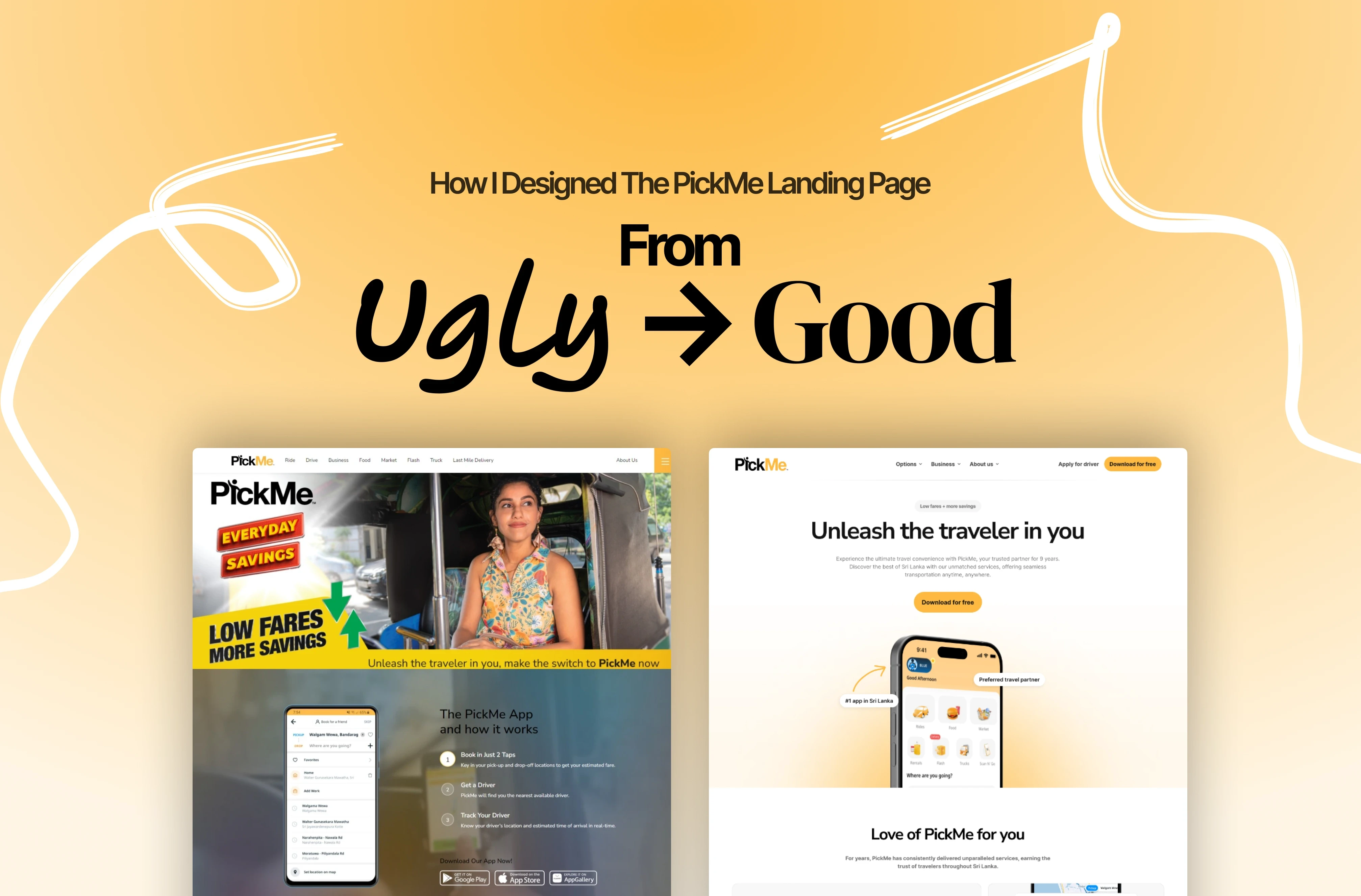
For a preview of redesigned PickMe landing page Click Here
What is PickMe?
PickMe is a technology-driven transportation platform that operates primarily in Sri Lanka. Founded in 2015, PickMe has quickly become one of the leading ride-hailing services in the country, offering convenient and reliable transportation solutions to both passengers and drivers.
PickMe functions through a mobile app, which allows users to book rides, track their drivers in real-time, and make cashless payments. This technology has revolutionized the transportation sector in Sri Lanka, providing an efficient alternative to traditional taxi services.
To begin, let's understand the importance of the application that we are dealing with. According to ICTA.LK , to-date PickMe has the largest vehicle fleet in Sri Lanka with over 12,000 enlisted drivers and one million registered users.
Is a landing page important for a mobile app?

Is a landing page truly vital for a mobile app when users can easily download it from the Play Store or App Store? Let's delve into some gathered insights to shed light on this question. According to Unbounce, the significance of app landing pages becomes apparent through data analysis.
According to Unbounce.com, having landing pages for mobile apps enables you to communicate more effectively with your intended audience and guide them straight to your desired action. By keeping these landing pages focused and free from distractions, you often see a significant increase in app downloads or conversions compared to sending visitors to a typical download page. Additionally, these pages allow you to delve deeper into your app's features and benefits, incorporate testimonials (including video testimonials), and include trust indicators like review scores or badges.
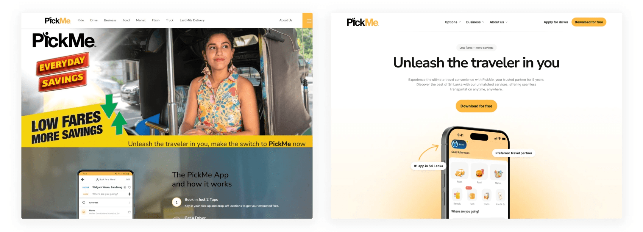
Let's take a look at the current PickMe landing page
What’s wrong with the PickMe landing page?

Here's a detailed analysis at the current PickMe landing page and why it might struggle to convert visitors or provide a clear understanding to users. My analysis is backed by research articles to support these findings.
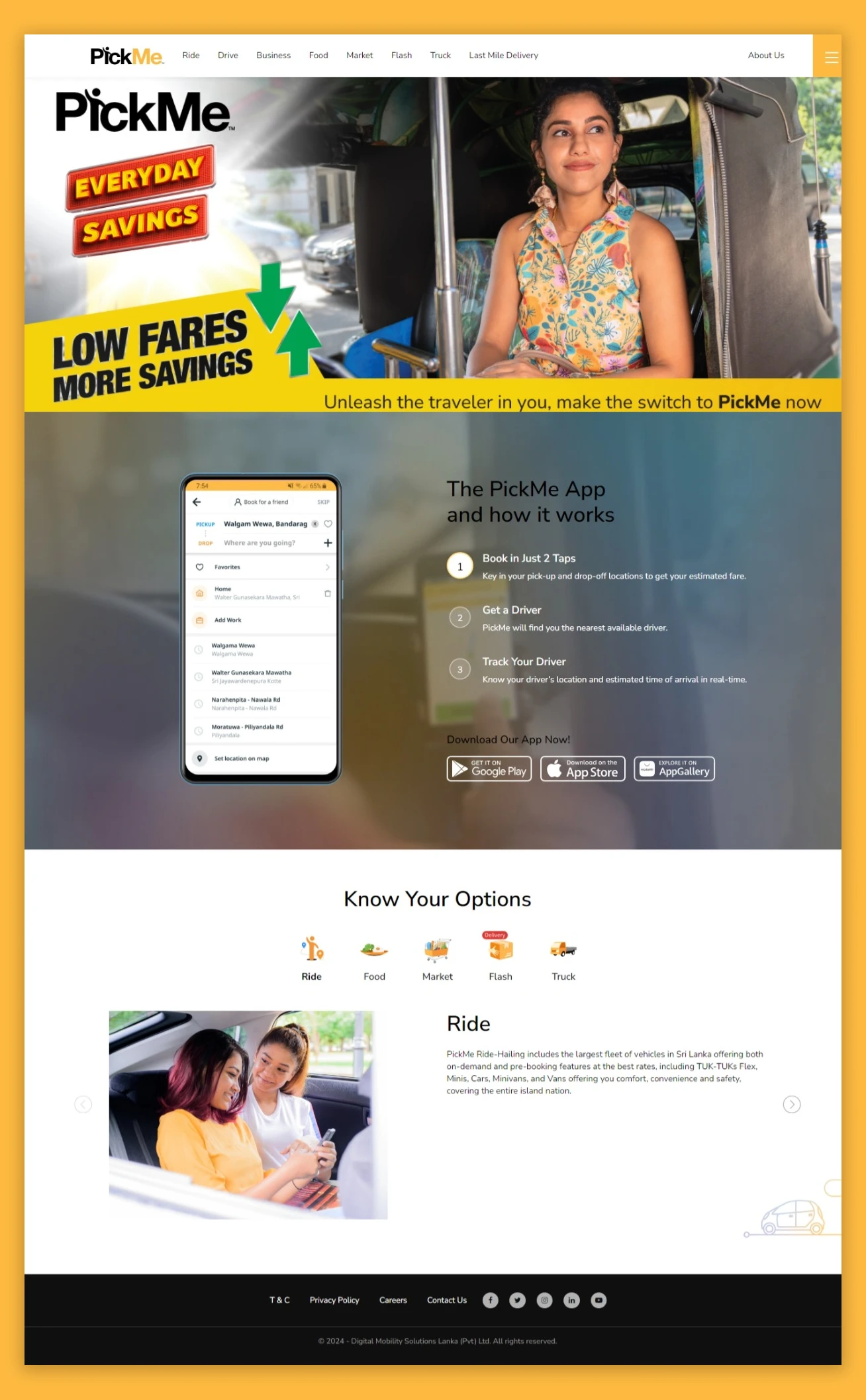
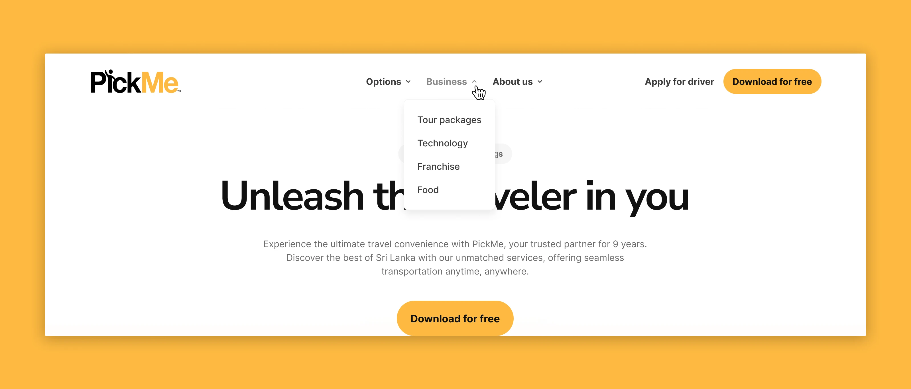
Navigation bar
In an article by Jimit Mehta from Abmatic AI discussing landing page importance, they emphasize the significance of having a clear and intuitive navigation bar. They point out that if users struggle to find what they're looking for, they may lose interest in exploring the landing page further. To achieve this clarity, they suggest organizing content into easy-to-understand categories, labeling links clearly, ensuring navigation accessibility from every page, and thoughtful grouping and ordering of links.
Let's take a look the current navigation bar on PickMe landing page.
Based on the image provided, it's evident that the navigation bar doesn't meet the criteria of being "clear and intuitive," as highlighted by Abmatic AI. One glaring issue is the lack of grouping for navigation links. Additionally, some navigation options are hidden within the burger menu, which might not effectively engage desktop users, potentially impacting conversion rates.
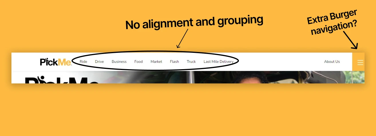
Hero section
The hero section of a landing page is the initial part that grabs a user's attention upon visiting. As advised by Instapage, it should intrigue visitors to keep scrolling by offering a sneak peek of what's to come, sparking curiosity right from the start. Given that visitors have a short attention span when they first land on a page, this section plays a crucial role in determining whether they stay or leave.
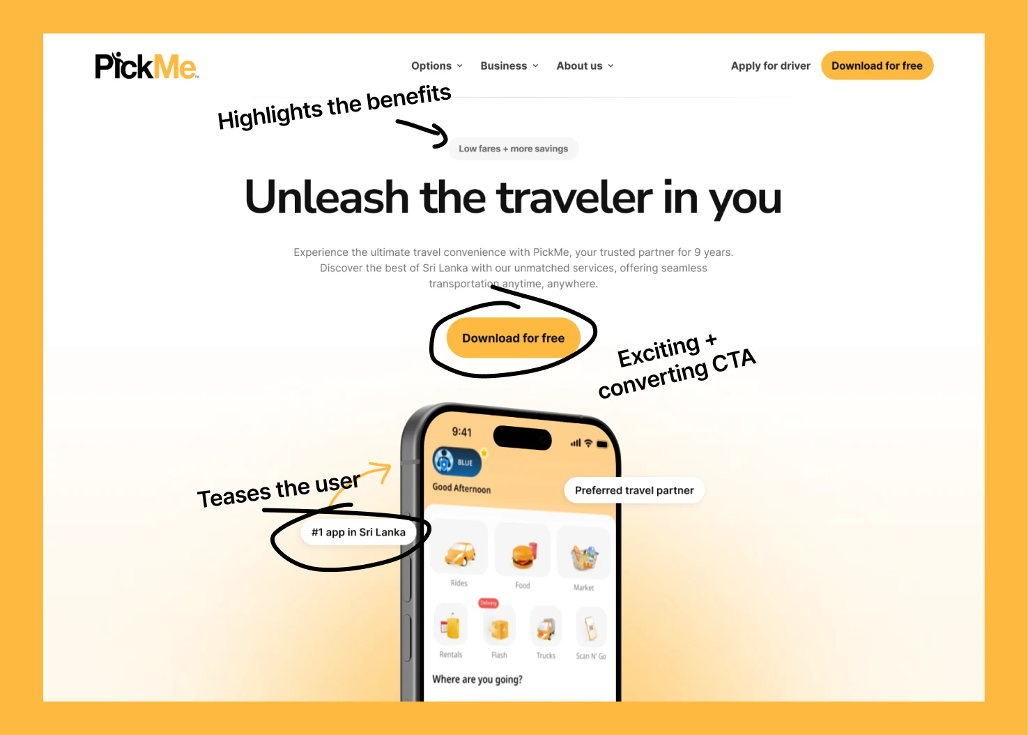
Let’s take a look at the current hero section of the PickMe landing page.
It's evident that the current hero section doesn't fulfill its role effectively. Rather than captivating users with an engaging headline, sub headline, and teaser to encourage further exploration, it simply consists of an image. This falls short of the recommendations outlined in the research articles mentioned earlier. To create a more appealing landing page, improvements are needed in these areas to captivate and excite users from the outset.
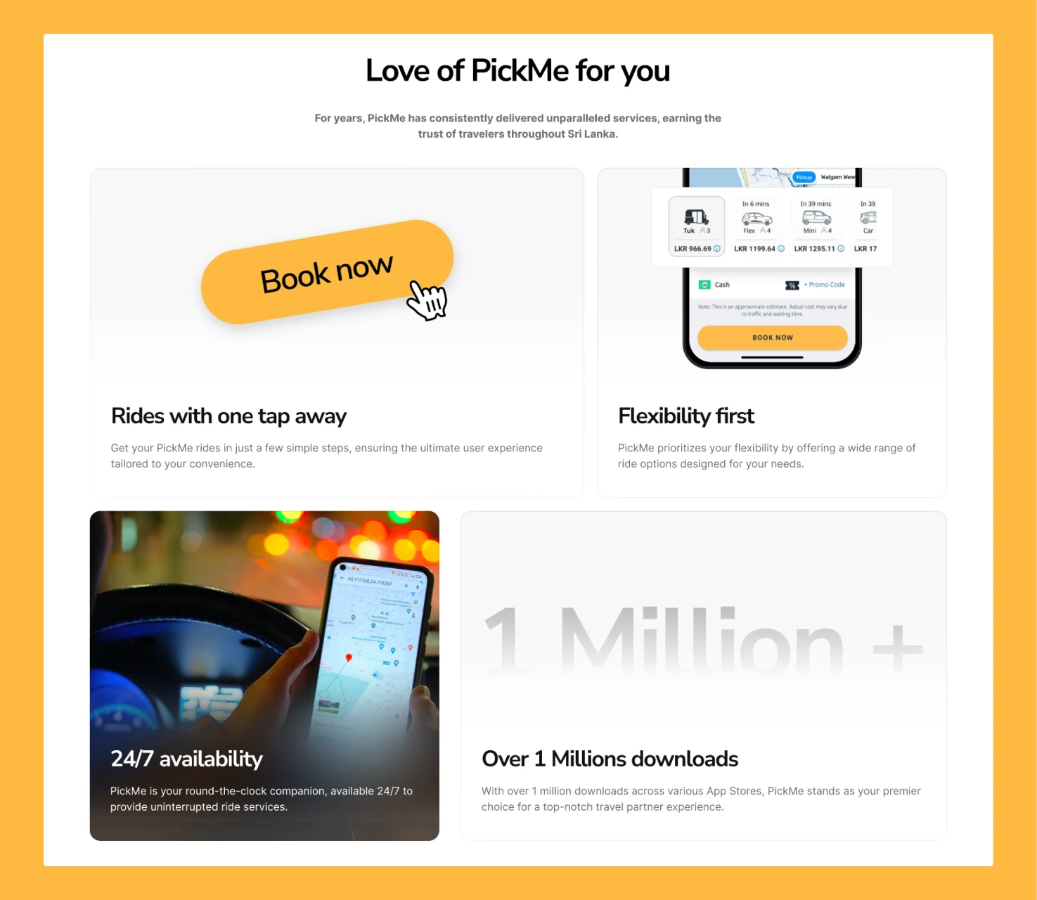
Product services
An application like PickMe offers various services aimed at providing users with flexible travel options. These services, along with their accomplishments, can serve as valuable marketing assets. Take Uber's landing page, for instance, which effectively showcases its services and capabilities to attract users. However, the current PickMe landing page lacks this kind of teaser or highlight. Leveraging their achievements could craft compelling copy for the landing page, enhancing its effectiveness in attracting users.
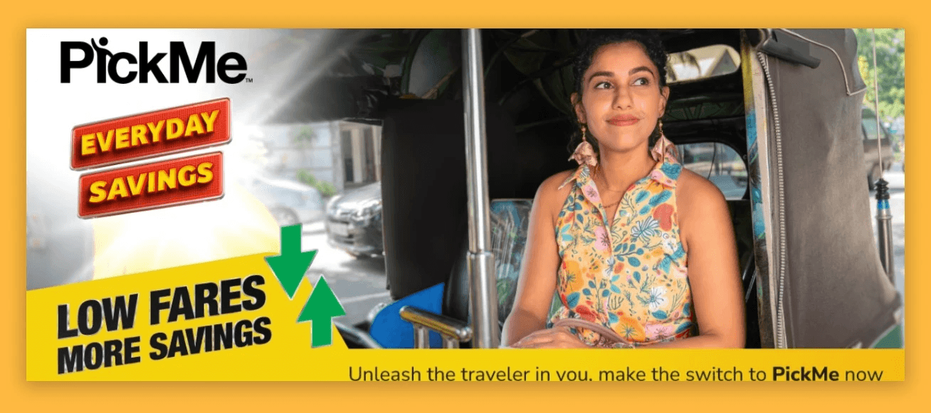
How it works conversion
Even though many people might already be familiar with how to use the PickMe app, as the UX designer, it's still crucial to ensure a smooth user experience on the landing page. Currently, the "How it works" section features a mobile mockup that changes only when users click on the numbers "1," "2," or "3." However, there's no clear indication that the content can be switched, which might lead users to overlook steps 2 and 3. According to research by Erik Runyon shows that only 1% of visitors click on the first item in any carousels,
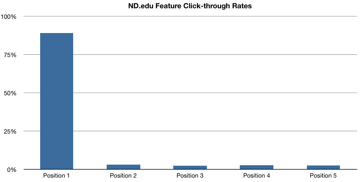
Therefore changing the mobile mockup wouldn't affect the accompanying text, but as a UX designer, it's important to make design decisions that enhance the overall user experience.
Closing argument
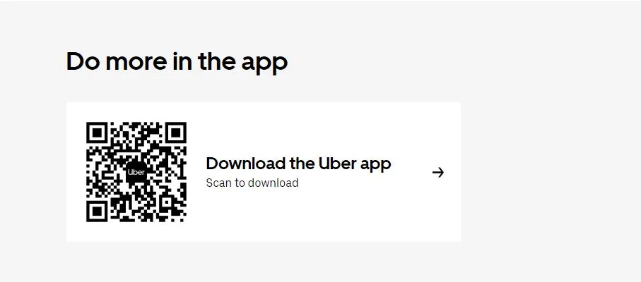
At the end of a landing page, it's essential to include a closing argument. This is where they make the final pitch to convince users to take action, such as purchasing the product. Unfortunately, the current PickMe landing page lacks a closing argument. By adding one, it could significantly improve the conversion rate, as it provides a final persuasive push to users who have gone through all the content. Here is an example of how Uber has done it in their landing page.
Now it is time to redesign

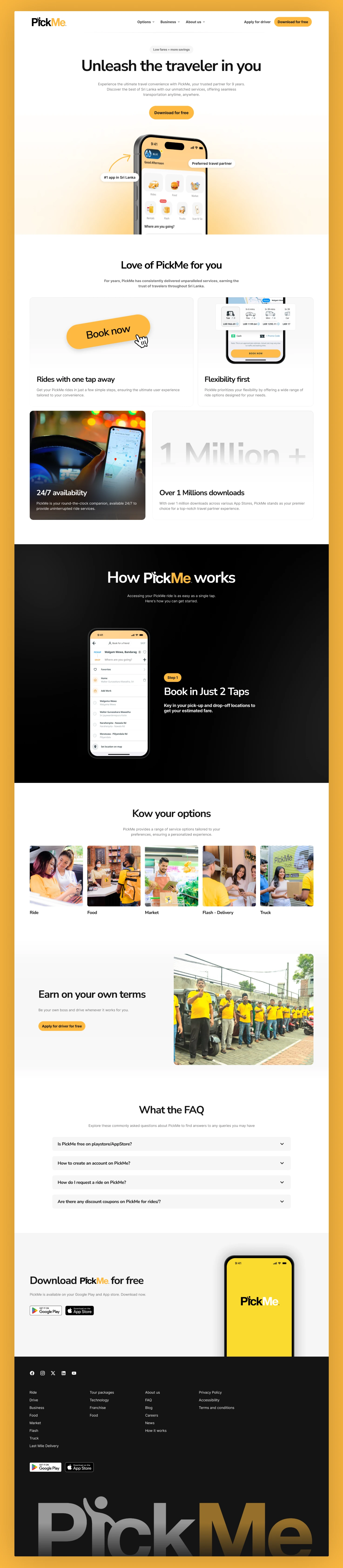
Full High Quality view of the redesigned PickMe landing page 👀💛
How the redesign will fix the current issues of the landing page

Clear and intuitive navigation
The newly designed navigation bar has group links for the user to engage now. Can easily navigate through different pages, providing a clear and intuitive experience for the user.
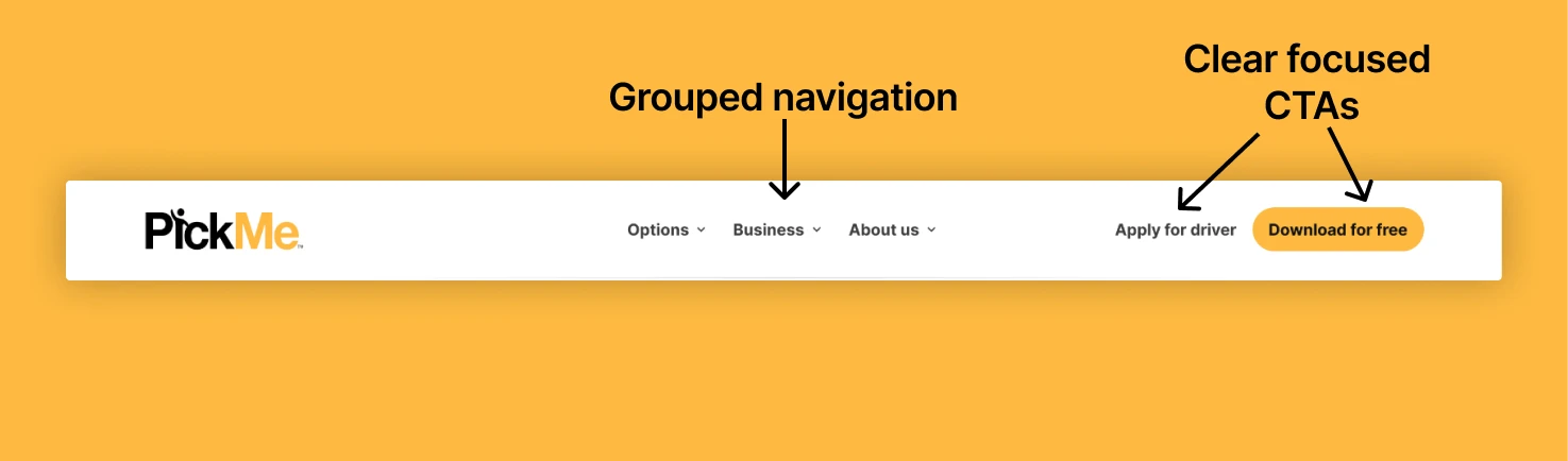
As well as, navigation options have dropdown for the user to select. With this the user can access all the navigation option from one center without getting confused.
Appealing hero section that teases the user
The new hero section shows a snippet of the PickMe app with a mockup device. As well as, "1# app in Sri Lanka" and "preferred travel partner" badges in hero section teases and excites the user to engage with the landing page more starting from the hero section.
Product services that teases the user
PickMe is widely recognized and has achieved significant milestones in Sri Lanka. However, their landing page fails to showcase either their services or achievements. To address this, I propose adding a section with Bento Grids. This section will effectively display both PickMe's services and notable accomplishments, engaging users and providing them with valuable information.
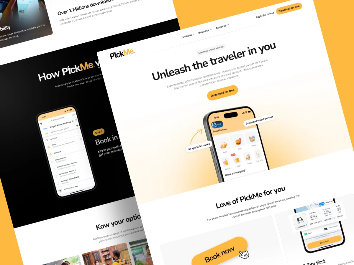
How it works with sticky scroll section that changes mockup variant
For the ‘how it works’ section with better Experience, I propose the design with sticky scroll section that changes the mockup variant. Below is a demonstration of how it should look in final.
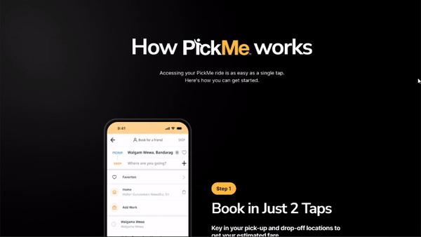
This is inspired by how Apple demonstrates the products on their page. With this, user is presented with the steps with its related interfaces, instead of the user clicking the steps to change the mockup device which was in the current PickMe design.
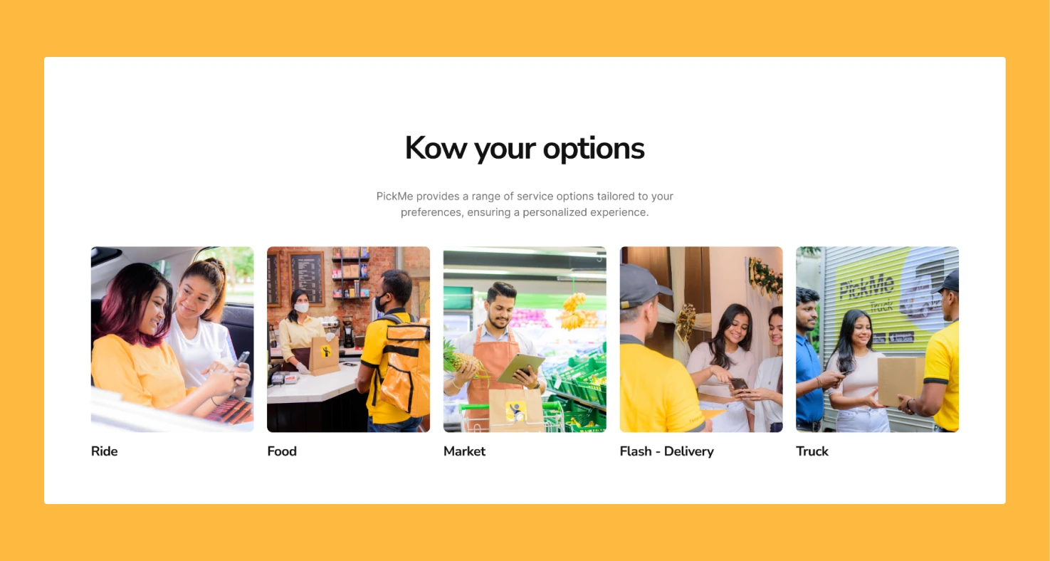
The user options with a grid
In the current design, only one image is shown in the carousel, and it's not clickable to navigate to the inner page. However, in the redesigned version, I've opted for an image grid layout to display all options upfront. This change is expected to improve user conversion, as research suggests that at least 1% of visitors tend to click on the first card.
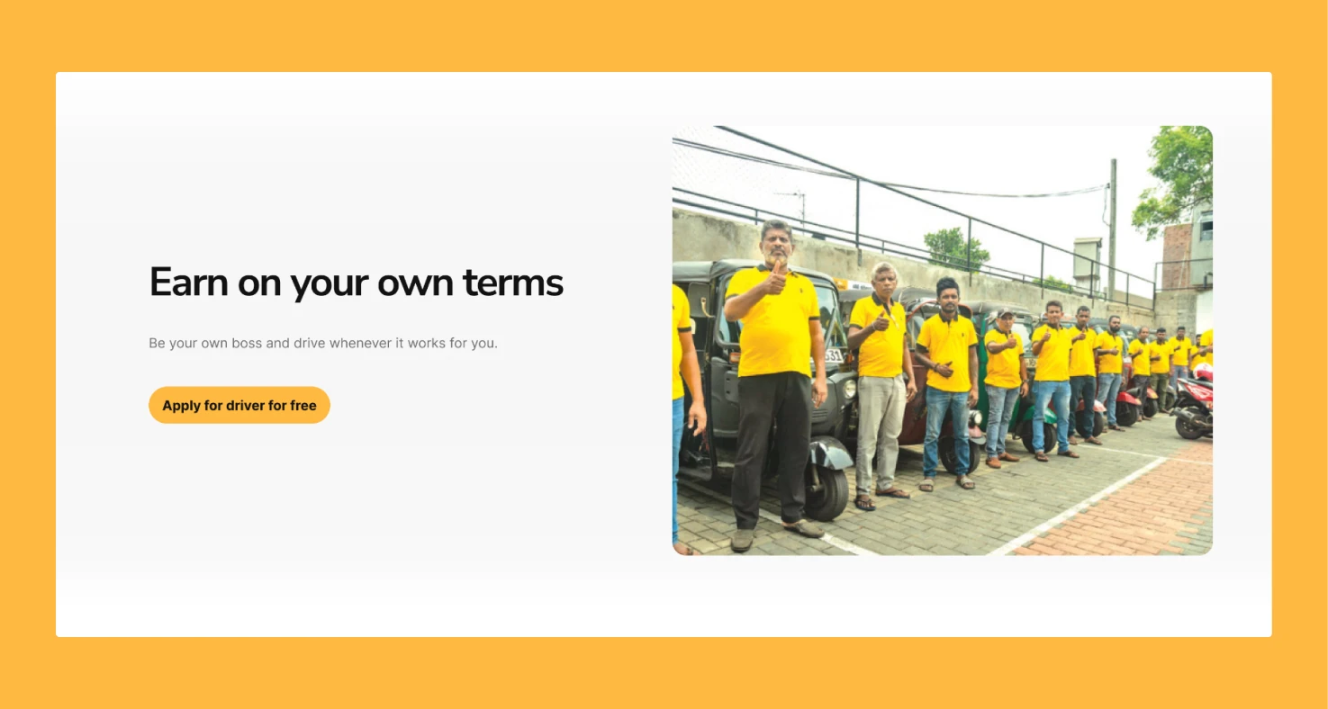
PickMe drivers section for driver user engagement
In general, there are two primary user groups that interact with the PickMe app: travelers and drivers. Both of these groups contribute to PickMe's revenue. However, the current landing page lacks a specific section targeting potential drivers, which could lead to missed opportunities for driver applications. As the designer, I've introduced a dedicated section for drivers, aiming to improve the number of driver applications.
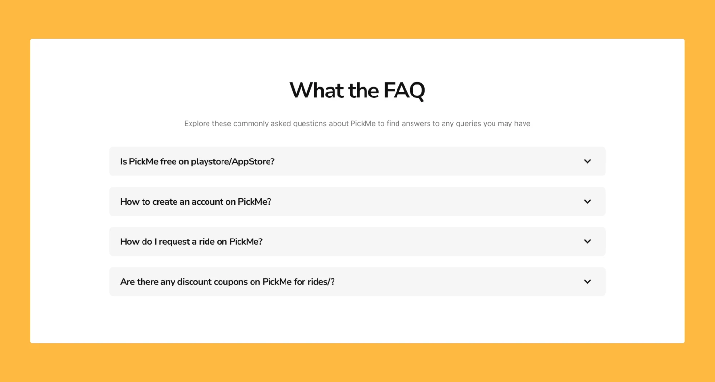
FAQ section for users to understand
The FAQ section is added as an extra element to the design copy for the user to understand the product much better.
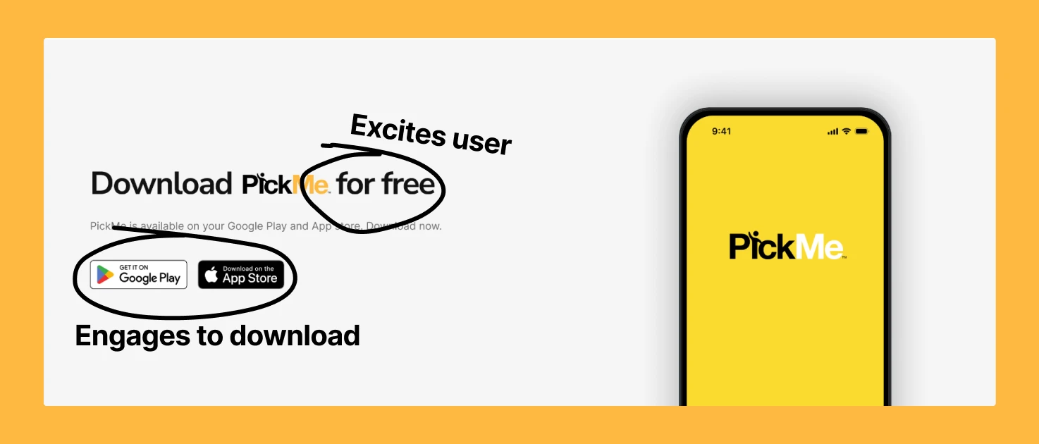
Download PickMe promotion
In the redesigned landing page, I have emphasized the importance of a closing argument by introducing a new promotion container. After users have read about all the services, features, and other information, this final promotion serves as a compelling reason to download the mobile application. If users proceed to download the app, it indicates that the design and copy have resonated effectively, leading to an improved conversion rate.
Well that's all folks. That's how a landing page is designed that converts better
Before → After