
Streamlining Financial Operations for Digital Tourism
Digital Tourism is a peer-to-peer platform connecting international travelers with local driver-guides in Sri Lanka. By bridging the gap between independent travelers and local expertise, the platform serves as a cultural gateway, offering immersive experiences that traditional tours often miss.
The Challenge
As Digital Tourism scaled, the reliance on manual booking via social media created a fragmented operational workflow. Managing an extensive network of independent drivers became increasingly complex, particularly regarding financial reconciliation.
The Problem Space
The existing manual system suffered from three critical friction points:
Operational Blind Spots: Inefficient reservation tracking led to communication gaps between the platform and its driver network.
Revenue Leakage: Without a centralized system, the company struggled to track when payments were collected by drivers, leading to delayed settlements.
Information Asymmetry: Drivers lacked a streamlined mechanism to know exactly when and how much to collect from tourists, posing a risk to the brand's professional reputation.
My Role: Designing the Collector Experience
I was tasked with designing the Payment Collector Interface. My objective was to create a high-utility tool that empowers collectors to manage financial transactions with precision and speed.
Payment Collector is the user type that collects payments from the driver.
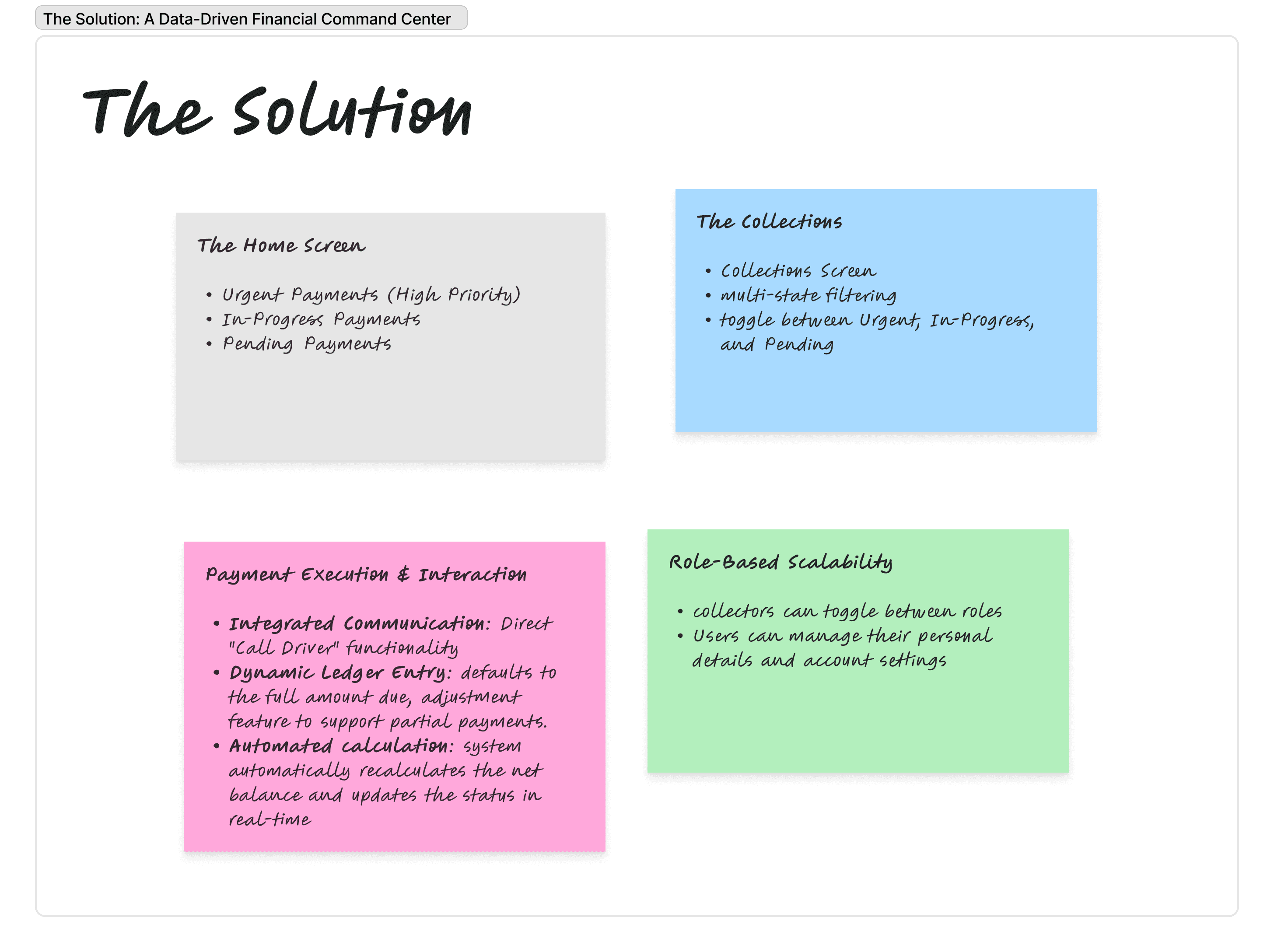
The Solution: A Data-Driven Financial Command Center
The UI was architected to transform a high-risk manual process into a structured, error-proof digital workflow. Every screen serves a specific stage of the payment reconciliation lifecycle.
Proposed Solution | Primary UX Metric | Strategic Value |
Urgency-Based Hierarchy | Time-to-Action | Reduced Revenue Delays: Prioritizing deadlines at the top of the feed ensures critical tasks are never missed. |
Dynamic Adjustment Logic | Data Accuracy | Minimized Discrepancies: Allowing manual overrides for partial payments ensures the digital ledger matches real-world cash flow. |
Integrated Call Triggers | Efficiency | Operational Speed: One-tap driver contact within the payment screen removes friction from the collection process. |
Dual-Role Profile Switcher | User Retention | System Scalability: Simplifies the UX for power users holding multiple responsibilities within the Digital Tourism network. |
Designing the User Interfaces
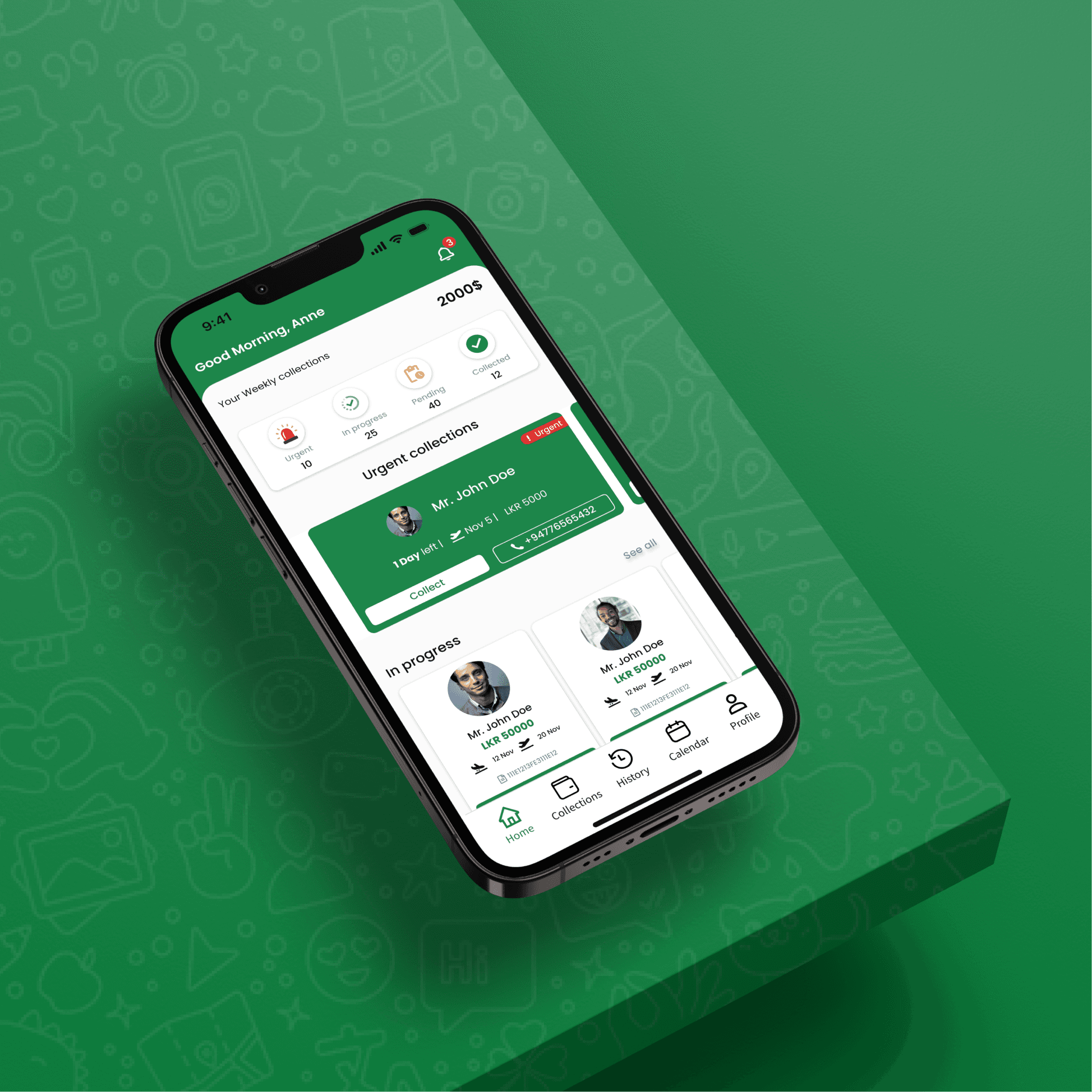
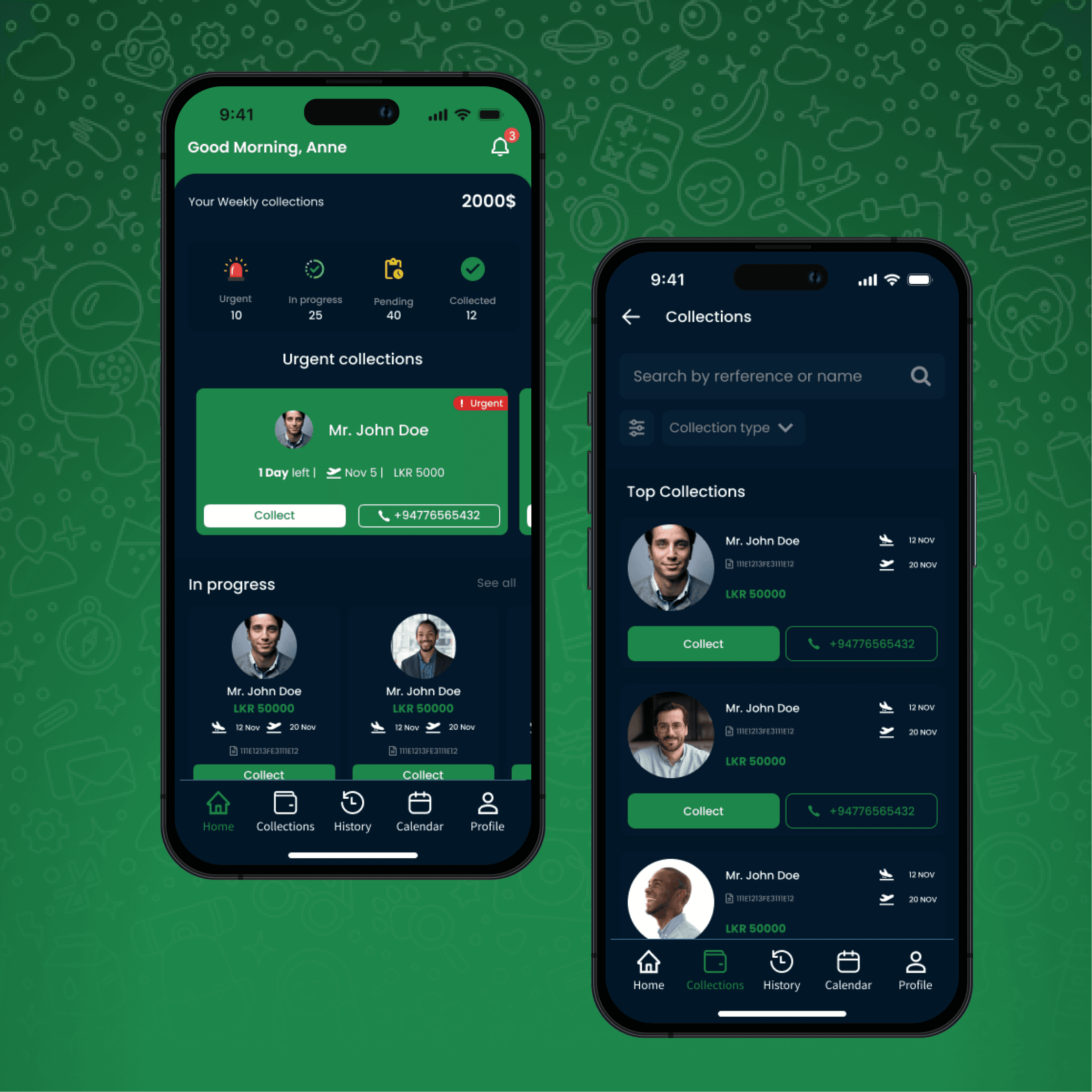
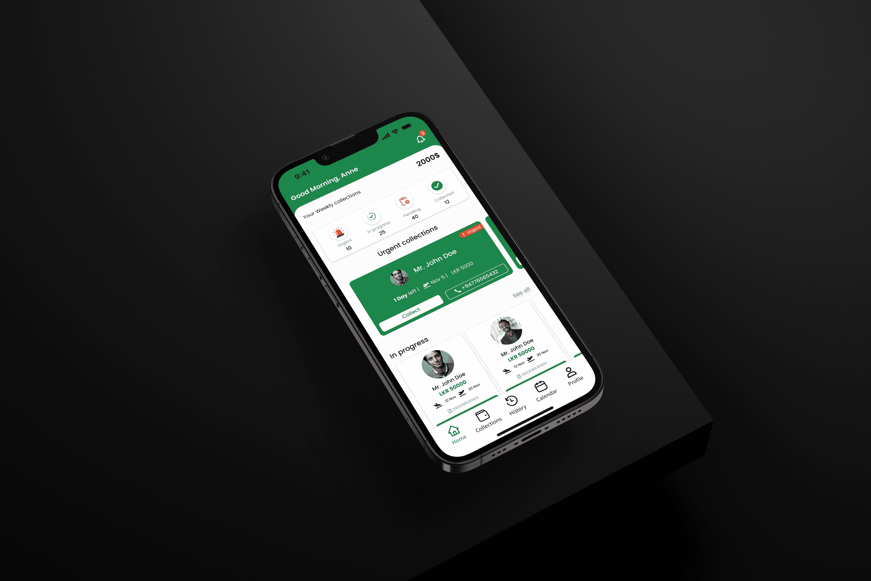
Home screen
The problem
The main problem was that the payment collectors need to collect payments from the drivers. They need to know which payments should be prioritized. Otherwise, they might miss the important ones. As the designer, I also have to make sure that I follow the current design system.
The Solution
The goal was to make it easy for payment collectors to see payments, especially the important ones first. So, as a designer, I made a carousel that shows the urgent payments at the top.
The home screen design prioritizes urgent payments by prominently featuring them at the top for attention. In addition to urgent payments, non-urgent payments are categorized into two main sections: "In-Progress Payments" and "Pending Payments." In-Progress Payments represent transactions that have been partially paid, while Pending Payments means to amounts that have not been collected at all. This structured layout ensures a clear distinction and easy navigation for users to manage both urgent and non-urgent payments efficiently. Down below is UIs that is designed for home screen for the user.

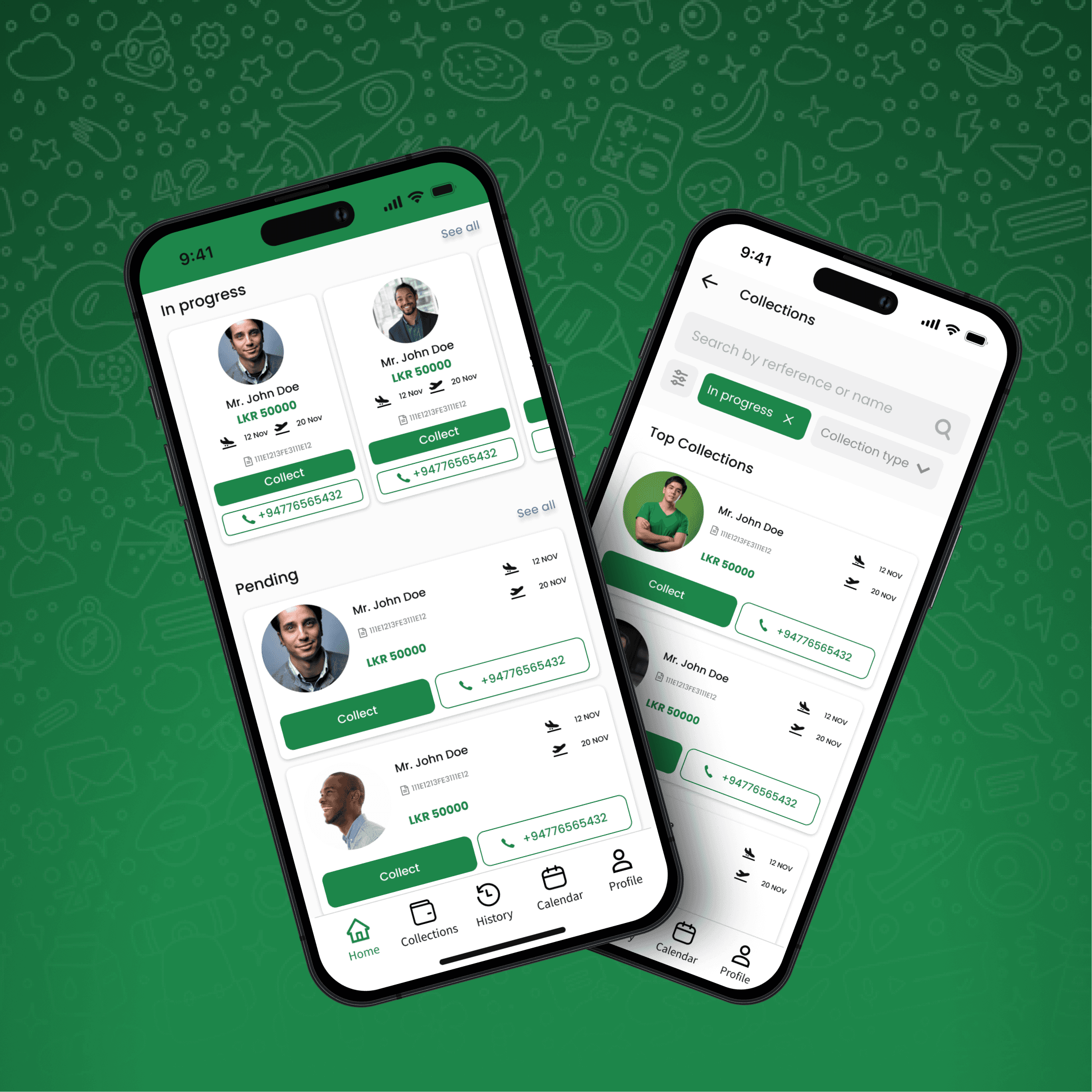
Collections screen
Collection screen displays all the collections assigned to the payment collector. They are given features sort all the collections by; urgent payments; in progress payments and pending payments.

Payment screen
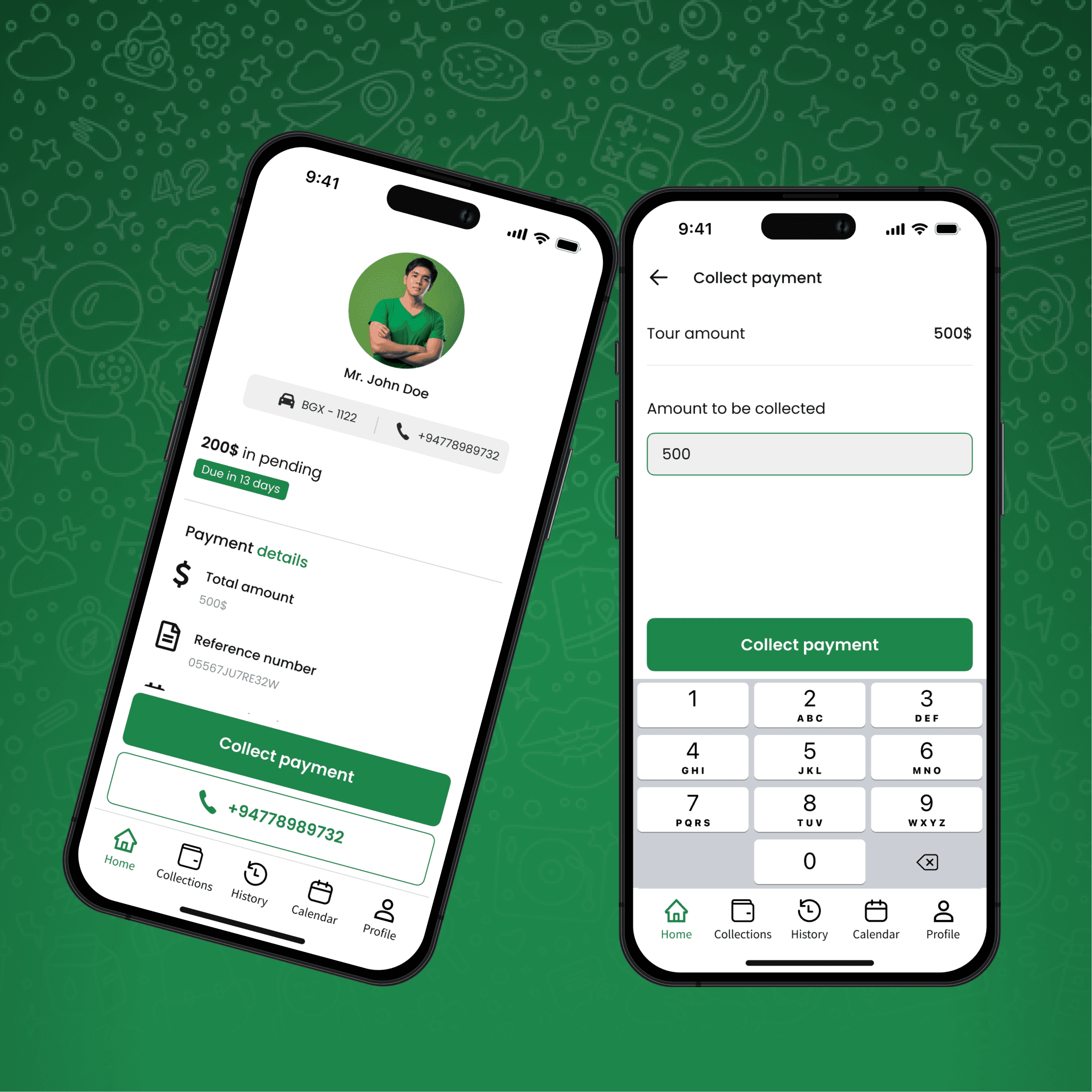
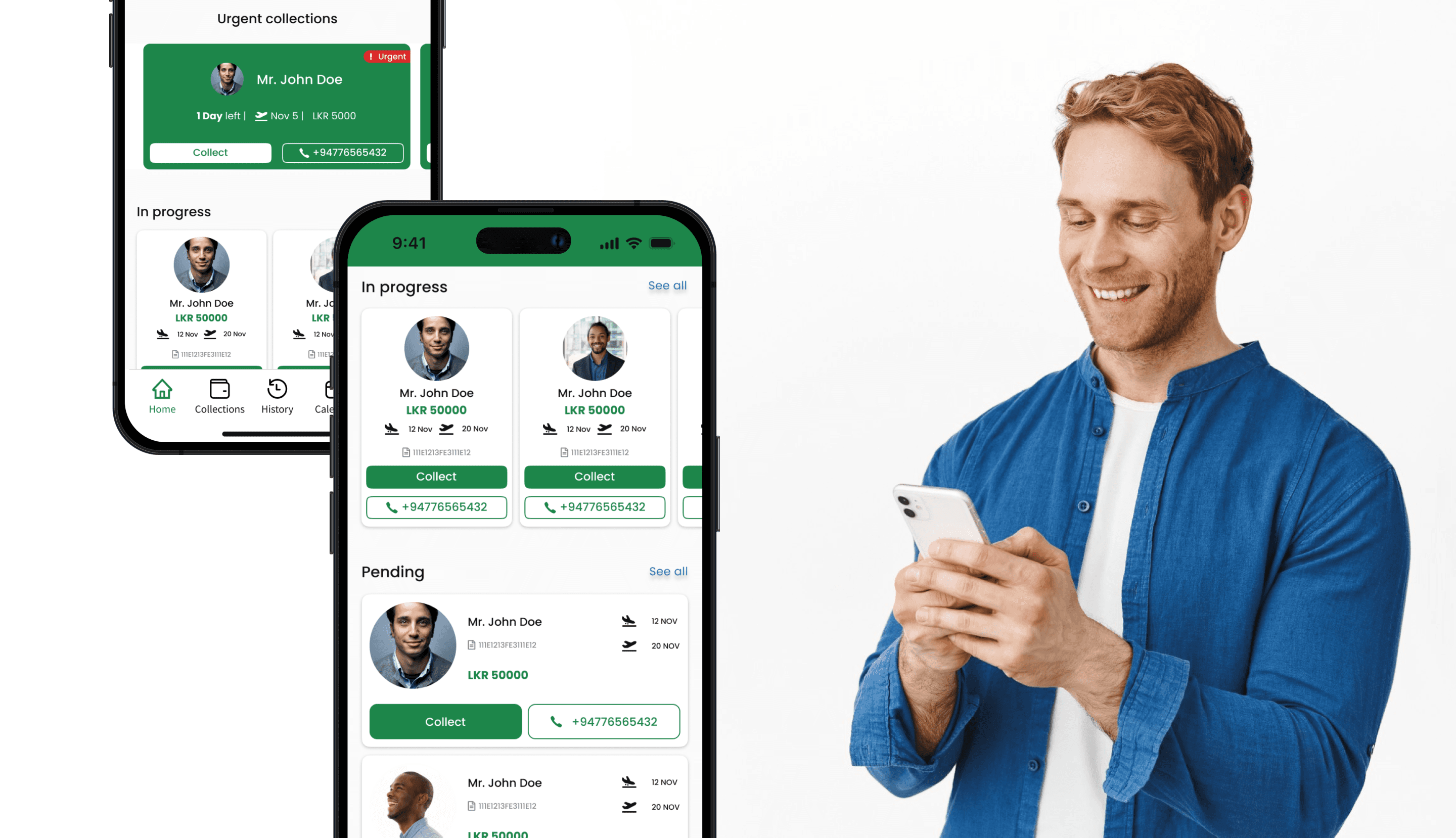
The problem
The payment screen is very important because it’s where the user starts the payment process. We also want to make sure the payment collector can easily reach the driver. So, the screen shows how much money needs to be collected, the due amount, and also gives a way to contact the driver.
The Solution
So I designed the screen with a button to call the driver and another button to collect or deduct the payment. When you tap the call button, it opens the phone app. The screen also shows all the important information clearly.
The Payment Details screen provides information regarding a specific payment. This screen is designed to offer convenient access for users to both collect payments and initiate a call to the designated payment collector. It ensures a seamless and efficient experience by centralizing payment-related actions in one easily accessible location.

Payment collect screen
The problem
Collecting payment was the most important part. Since the drivers are holding the cash, we made sure the collector can collect it manually. We also designed it in a way that helps the payment collector collect the correct amount.
The Solution
My solution was to let the payment collector type in the amount they want to collect. Once they enter it, that amount is automatically deducted from the total. This makes the process easy and smooth.
The Payment Collection screen serves as the focal point for users, particularly payment collectors, to gather payments from drivers. Initially, the screen displays the default amount in a textbox, representing the total payment due. However, the collector has the flexibility to manually adjust this amount, allowing for partial payments.
Upon adjustment, the registered amount is recorded within the system, subsequently deducting it from the total. The net amount to be collected is then displayed, streamlining the collection process and providing a clear visual representation of the transaction. This user-friendly interface ensures adaptability to different payment scenarios while maintaining accurate records within the system.

Profile screen
As a drive can be a payment collector, the user has a feature to switch profiles. User can click the profile picture and do the profile transition. As well as, they can edit their profile details as well.

Conclusion
The conclusion is that, as the designer, I have understood and learned how to design mobile applications and keep it consistent with the design standards that are being followed. As well as improved on receiving design and feedback at the of iterations and applying them on the product for better User Experience.