


Challenge at CEM
The Sri Lankan financial advice landscape is often perceived as gate-kept, expensive, and intimidating. Users struggle with specific "money problems" from retirement planning to property disputes—but don't know who to trust or how much it will cost. The Challenge: A Crisis of Trust & Clarity
Through initial stakeholder interviews and market analysis, I identified a significant "advice gap" in Sri Lanka. Down below are findings.
My Task as the designer
My primary objective was to design a B2C platform that removed the "complexity barrier" currently preventing everyday users from seeking professional financial advice. I was responsible for transforming a high-friction, traditional consulting model into a modern digital experience
User Research & Insights
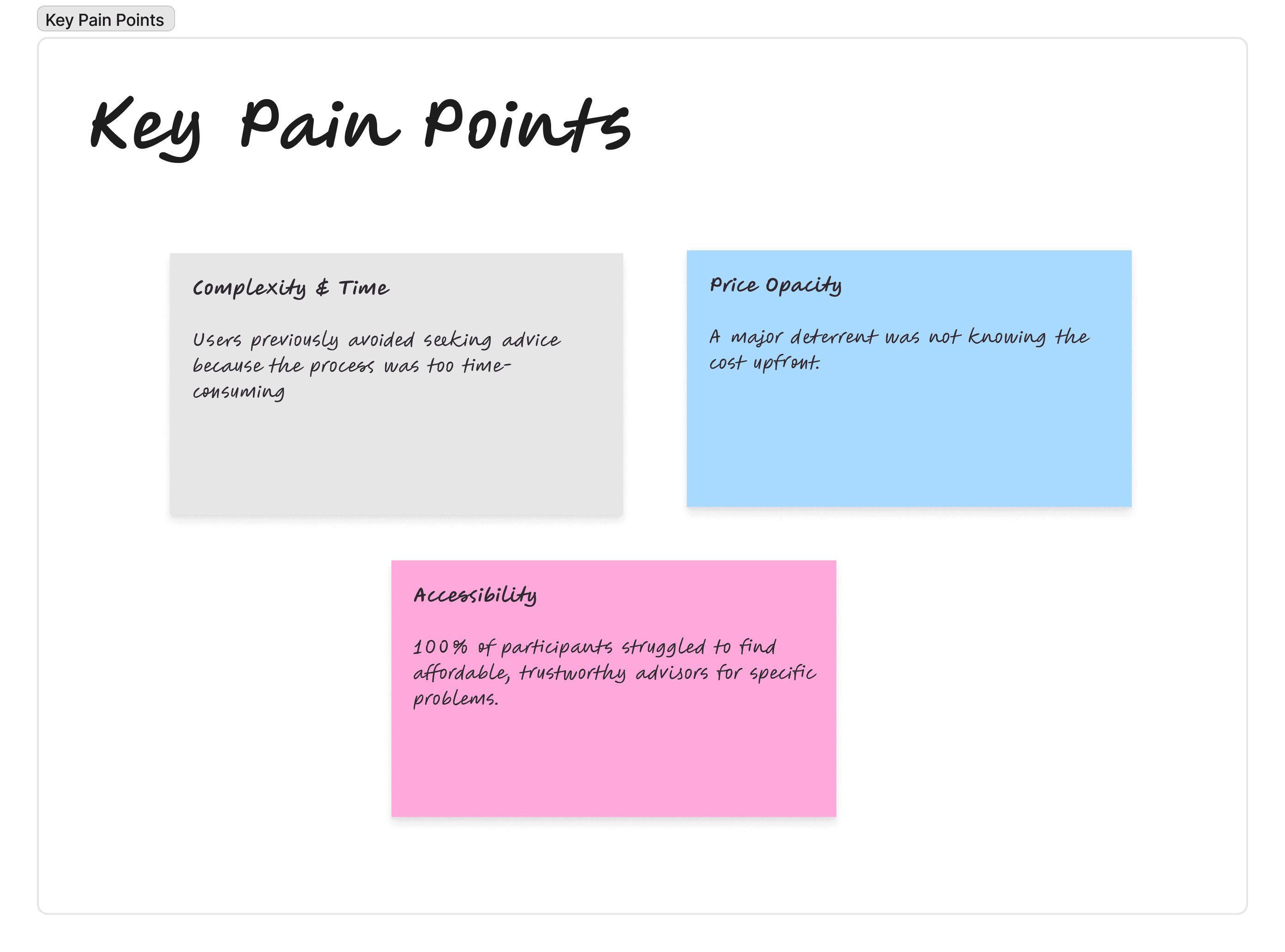
We surveyed 15 diverse participants (Ages 26-45) to validate the problem. The data revealed critical friction points in the "traditional" way of seeking advice.
Before pushing any pixels, I initiated a discovery phase to validate the friction points in the current financial consulting landscape. My primary objective was to understand the emotional state of a user in financial distress. These users aren't just looking for data; they are looking for trust, clarity, and speed.
I structured the research to move beyond surface-level aesthetics, focusing instead on the information architecture of the search experience and the credibility indicators required to make a user feel comfortable paying for advice online.
Research Questions & Objectives
The following table outlines the strategic inquiries that drove the foundational UX of Money Doc:
Research Question |
|---|
I would find it useful to search for financial advisors by their name or by the specific type of advice I need (e.g., 'retirement planning'). |
Being able to compare advisors and book the one offering the cheapest price would help me make better decisions. |
I prefer platforms where I can easily see all available services on the home page without having to navigate through multiple menus. |
I currently struggle to find affordable, trustworthy financial advisors in Sri Lanka who can help with my specific money problems. |
A platform that matches me with the right financial advisor based on my needs would save me time and effort. |
I would feel more confident booking a financial advisor if I could see their rates upfront before committing. |
The ability to book consultation sessions quickly and easily online is important to me. |
I have avoided seeking financial advice in the past because the process of finding and contacting advisors was too complicated. |
I would use a platform that lets me pay only for individual sessions rather than signing long-term contracts. |
Having simple, direct access to different financial services from one platform would solve many of my current problems. |
Validating the Quantitative Insight
To ensure the Money Doc platform addressed real-world friction, I conducted a quantitative research study focusing on user pain points and feature desirability. The data revealed an overwhelming demand for transparency and accessibility in the financial advice sector
By identifying that users were actively avoiding traditional services due to complexity and the struggle to find affordable help, I was able to advocate for a minimalist UI that prioritizes cost-transparency and rapid matching as our primary competitive advantages.
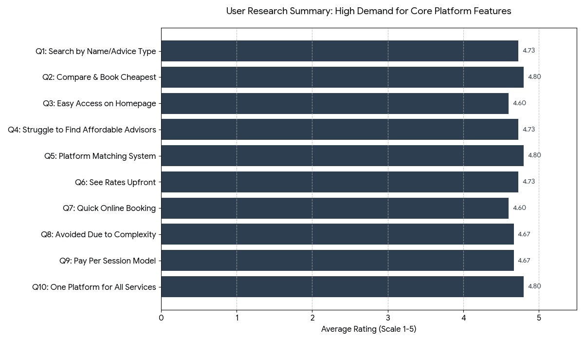
User Personas
I used User Personas to understand the emotional landscape and quantitative Preference Mapping to validate the product’s core functionality. The synergy between data sets revealed a clear market mandate, Financial advice is currently too opaque, too expensive, and too hard to access.
Problem vs. Solution
Following my research phase, I synthesized the core frustrations of our "Tech" and "Goal-Oriented" personas into a strategic execution plan. By mapping specific pain points directly to design solutions, I ensured that every feature on the Money Doc platform served a validated business and user need.
User Pain Point (Research Insight) | MoneyDoc Design Solution | Business/UX Value |
High Barrier to Entry: Users find seeking financial advice "too complicated and time-consuming" (Q8: 4.67/5). | Direct Service Access: A Bento-style homepage that categorizes complex financial problems into 6 simple, clickable icons. | Reduces cognitive load and time-to-task. |
Price Opacity: Users are frustrated by "hidden fees" and having to call to find out rates (Q6: 4.73/5). | Transparent Marketplace: Rates are displayed prominently on advisor cards before the user clicks into a profile. | Builds immediate trust and enables informed decision-making. |
Discovery Friction: Users struggle to find the "right" expert for specific problems like land disputes or retirement (Q4: 4.73/5). | Smart-Match Search: A natural-language search bar and matching algorithm that filters advisors by "Advice Type" rather than just name. | Increases relevancy and booking conversion rates. |
Commitment Phobia: Users avoid advice because they don't want long-term contracts or expensive retainers (Q9: 4.67/5). | Pay-Per-Session Model: A frictionless "Book & Pay" flow where users only commit to one individual session at a time. | Lowers the financial risk for the user, encouraging trial. |
Inefficient Booking: Traditional methods involve "phone tag" or back-and-forth emails to confirm availability (User Feedback). | Real-Time Calendar Sync: An "Uber-style" instant booking system where users pick an available slot and get immediate confirmation. | Eliminates drop-offs during the scheduling phase. |
This strategic alignment didn't just improve the UI; it created a scalable ecosystem. By automating the booking process with real-time calendar sync, we eliminated the traditional "phone tag" friction, removing a major drop-off point in the scheduling phase and allowing the platform to operate with minimal manual intervention.
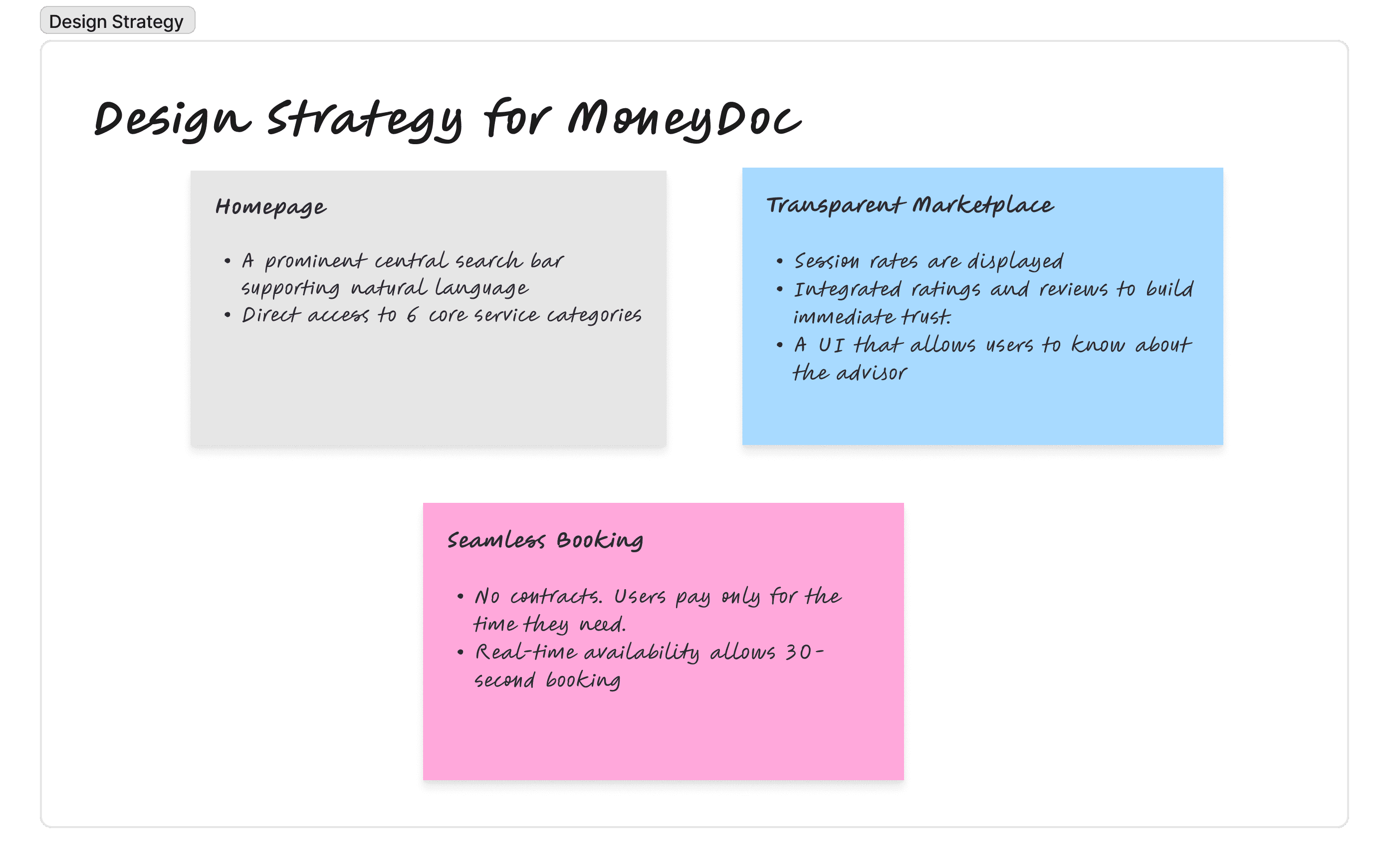
Design Solution
I developed a three-pillar design strategy for Money Doc. This framework ensures that every touchpoint from the first search to the final booking
User requirements
To ensure the design strategy was actionable, I translated my research insights into a formal set of system requirements.
Category | User Need | System Requirement (The "Shall" Statement) |
Discovery | Problem-based search | The system shall provide a natural language search engine that maps user queries (e.g., "debt") to advisor tags (e.g., "Debt Management"). |
Navigation | Immediate service access | The platform shall feature a "Zero-Layer" homepage architecture, exposing all 6 primary service categories via high-visibility icons. |
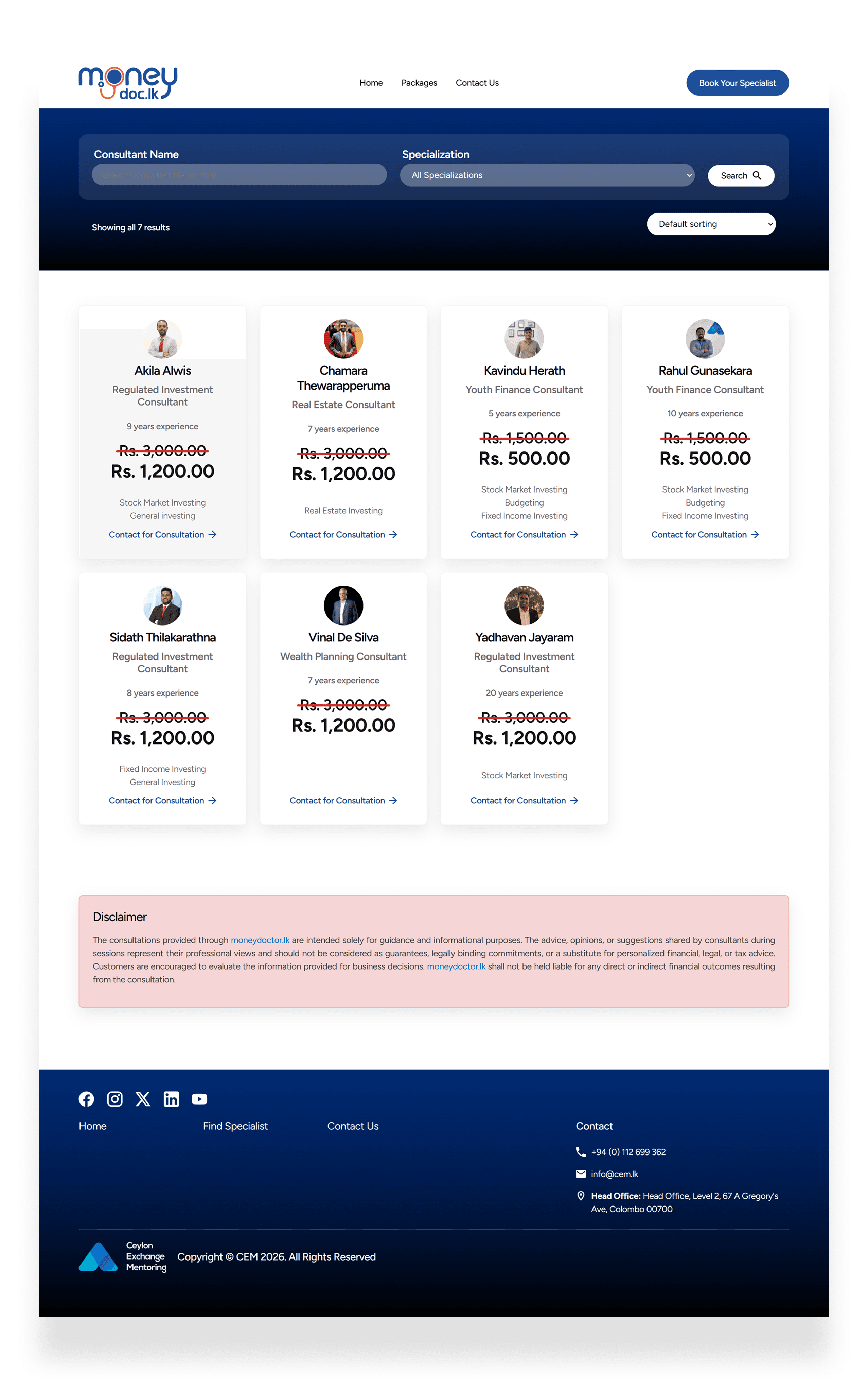
Trust | Cost certainty | The interface shall display the mandatory "Price Per Session" label on all advisor preview cards to ensure 100% price transparency. |
Comparison | Value-based selection | The system shall implement a multi-criteria sorting algorithm allowing users to reorder results by "Lowest Price" and "Highest Rating." |
Conversion | Frictionless booking | The platform shall host an integrated booking calendar that locks time slots in real-time and issues instant confirmation upon payment. |
Retention | Contract-free usage | The checkout flow shall be optimized for single-session micro-transactions, requiring no long-term membership or retainer commitment. |
Matching | Guided experience | The system shall include a "Smart Match" wizard that prompts users for their age and goal to filter the most demographically relevant advisors. |
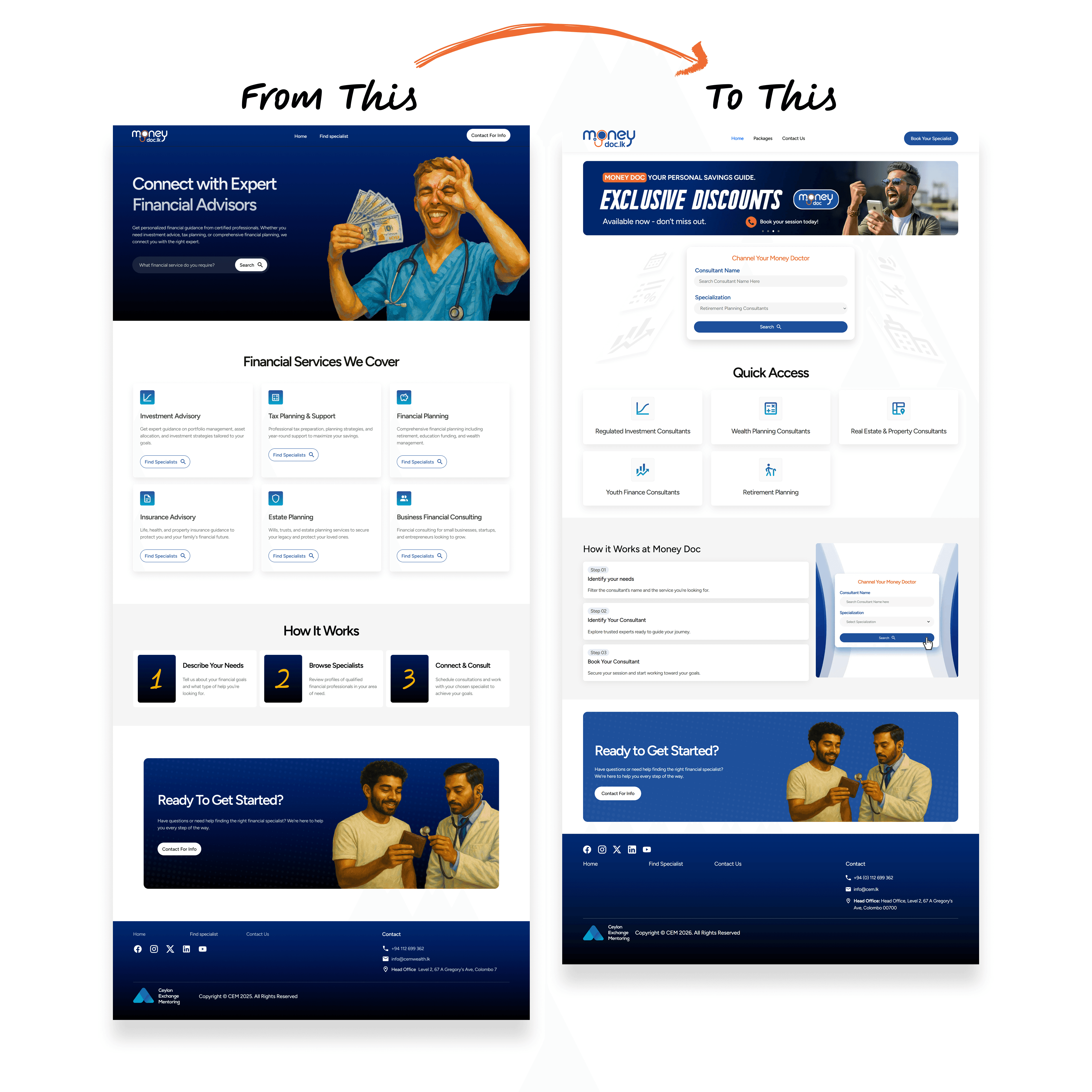
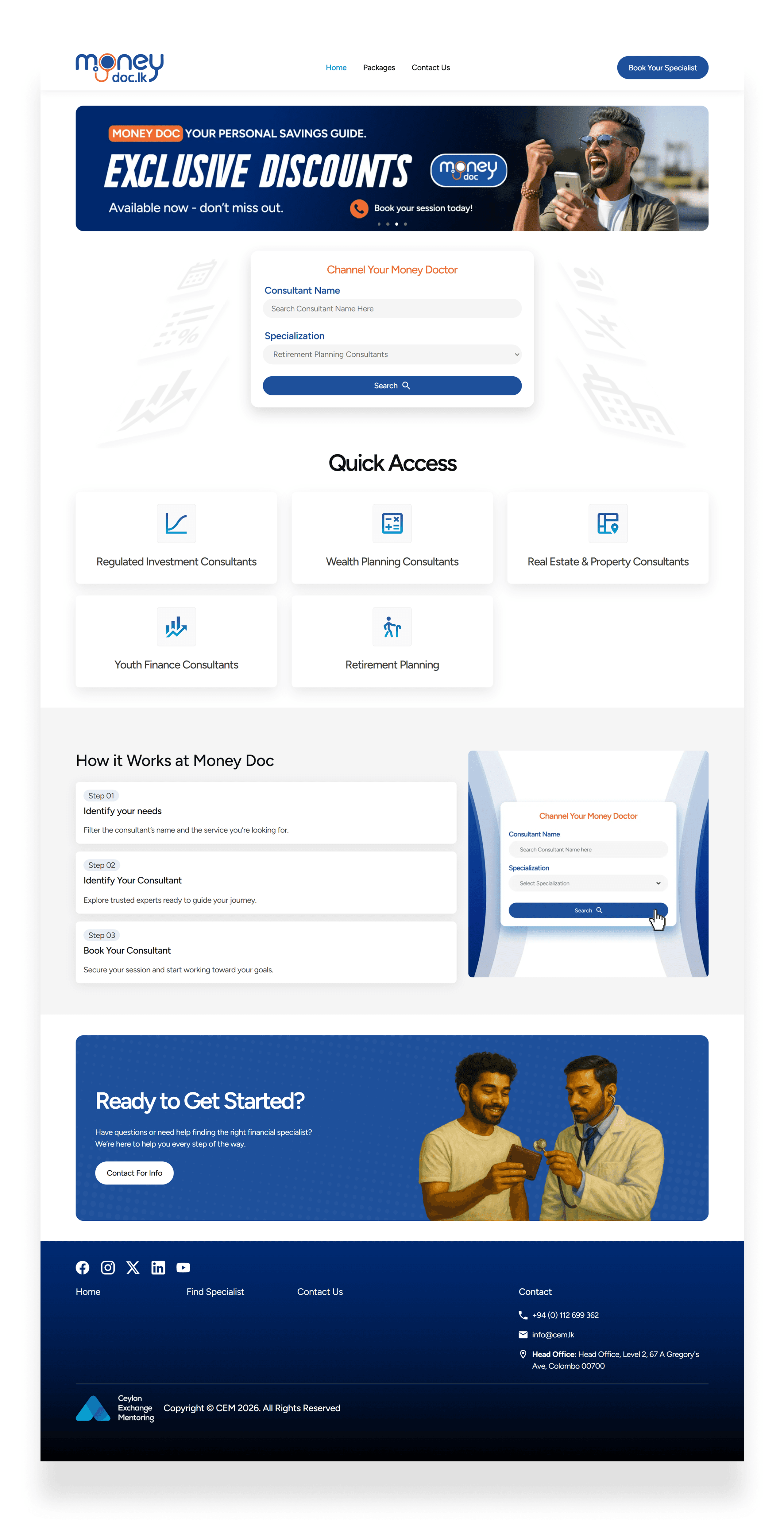
Design Result
Home Page
The final landing page for Money Doc serves as the primary touchpoint for democratizing financial expertise. By synthesizing user research with a "Search-First" architecture, I transformed a high-friction consulting process into an intuitive, accessible digital experience. Every design element on this page is a direct response to a validated user pain point.
Initial Iteration & Usability Insights
The first high-fidelity prototype was built in Figma, focusing on a service-based search experience. Usability testing quickly revealed a critical navigation pain point: participants struggled to locate consultants efficiently.
Two distinct mental models emerged:
Some users wanted to discover consultants by filtering on specific services.
Others expected (and repeatedly attempted) to search directly by consultant name especially when they wanted to return to a previously satisfactory provider.
This highlighted a clear gap: the search mechanism did not support both discovery and re-engagement use cases, which are essential for building user trust and retention in a consultant marketplace.
As a result, we evolved the search bar to support dual-mode querying by service and by consultant name; creating a more flexible, user-centered entry point to the consultant directory.
"Maybe I want to search by the name" - one participant added
Final Result
Version below positions you as a thoughtful senior designer who:
Conducts rigorous testing
Identifies competing user needs
Translates qualitative insights into clear product decisions
Prioritizes long-term user behavior (repeat visits, trust, retention)
Results page
My goal was to move beyond a static directory and create a dynamic marketplace that balances user urgency with expert authority.
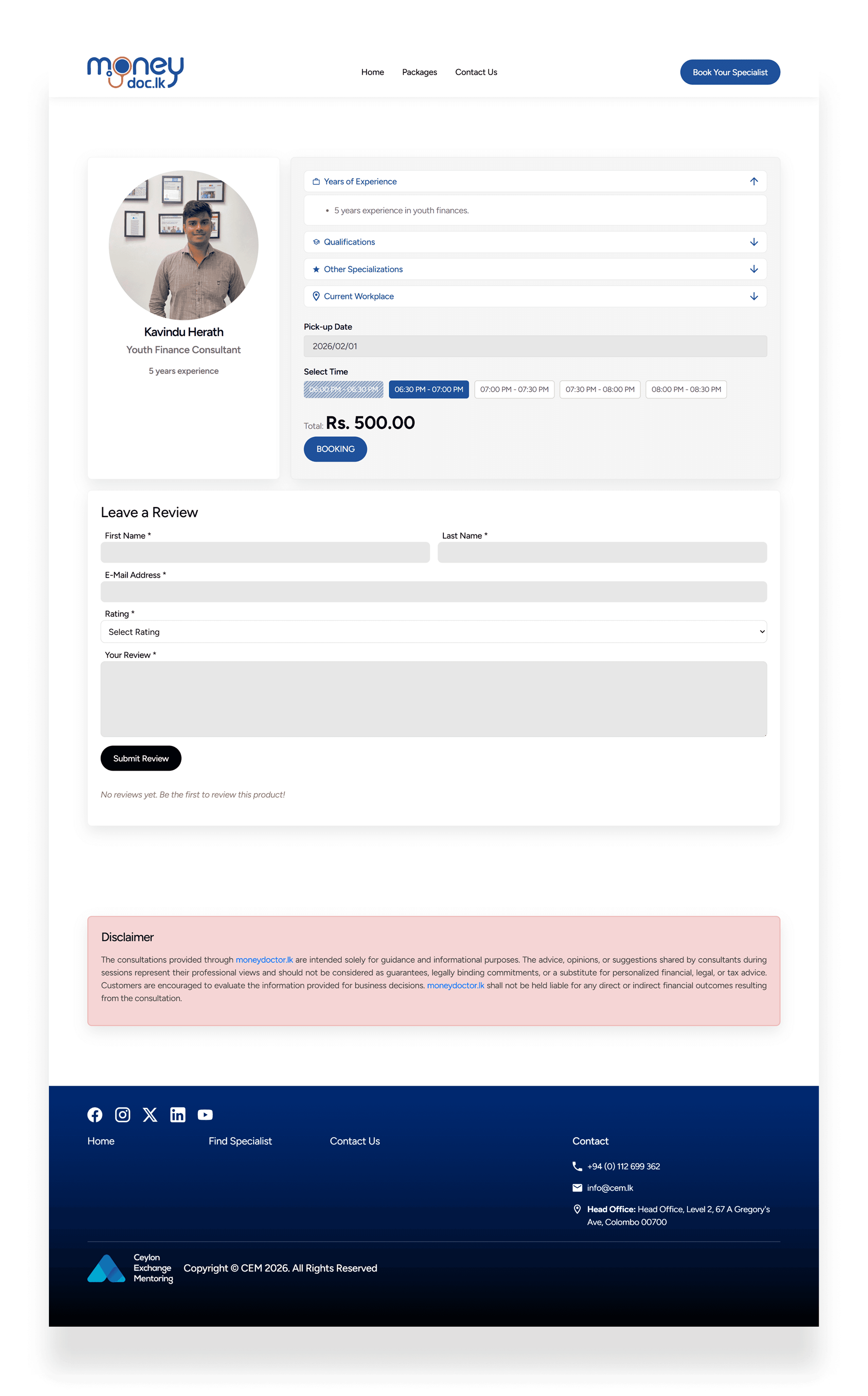
Details Page
For users already experiencing financial stress, this page must function as a credibility validator. My design strategy focused on transforming a standard profile into a comprehensive "Trust Profile" that addresses the psychological barriers of paying for digital advice.
Final Outcome & Impact
The redesign of the Money Doc platform transformed a fragmented, intimidating financial consulting experience into a streamlined, high-performance marketplace. By grounding every design decision in user research—specifically addressing high complexity and discovery friction—I delivered a solution that prioritizes user autonomy and speed-to-value.