
To view Figma Prototype click here
The Vision: Localizing the Booking Experience
While the global travel tech market is saturated with giants like Booking.com and Expedia, these platforms are often built on Western-centric mental models that create friction for the Sri Lankan domestic traveler. My role as the Lead UX Designer was to bridge this gap moving beyond standard templates to build a localized ecosystem that prioritizes cultural nuances over "one-size-fits-all" design.
The Opportunity
domestic tourism in Sri Lanka has some major "it’s complicated" energy. Local travelers are out here dodging currency drama like a pro, struggling with rigid payment setups that don't even talk to our local bank apps, and feeling a massive trust gap when trying to navigate those big, scary global websites. It’s basically like trying to run a marathon in flip-flops. My goal for this case study was to take all those annoying friction points and flip the script turning the whole booking mess into a super smooth, "no-stress" experience that actually speaks the language of the Sri Lankan market and makes people feel like their money is actually safe.
Let’s start the research and analysis
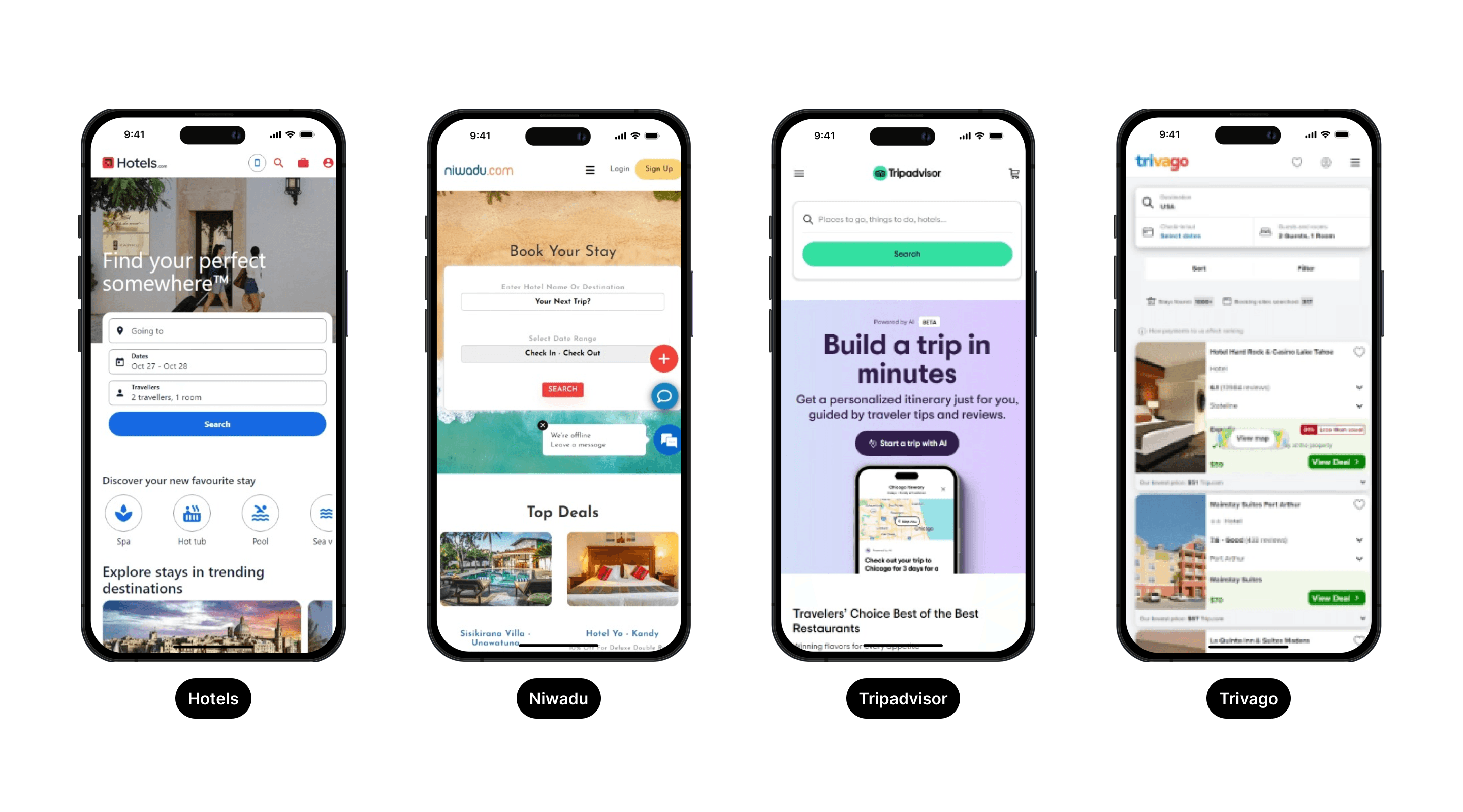
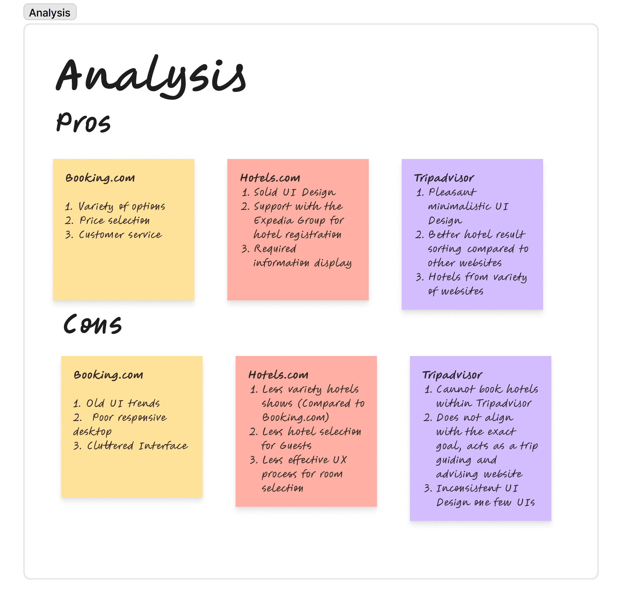
By auditing big players like Booking.com with its massive inventory, Hotels.com backed by Expedia's setup, and TripAdvisor with its focus on trusted reviews, I spotted a key gap in the market. These platforms do well on a global scale, but they create a lot of UX issues for local users. Booking.com and Hotels.com deal with old UI problems, messy layouts, and stiff room selection, while TripAdvisor's redirect system leads to a broken flow that hurts direct bookings. The aim was to pull together their strong points like solid stock and social proof into one clean, efficient interface that cuts out the old clutter and focuses on how people in the Sri Lankan market actually book domestically.
Strategic Audit: Benchmarking Global Patterns
To build a solid foundation for the platform, I did a thorough UX audit of leaders like Hotels.com, Booking.com, and TripAdvisor. Breaking down the full journey from search to room selection, I saw a constant pull between practical features and clean design. These global sites are strong on having tons of options, but they carry "UI debt" with stiff input rules, choppy navigation, and uneven performance across devices. The audit helped me zero in on where they fall short for today's users, giving a clear path to create a smoother, more local-focused experience that combines useful tools with a simple, modern look.
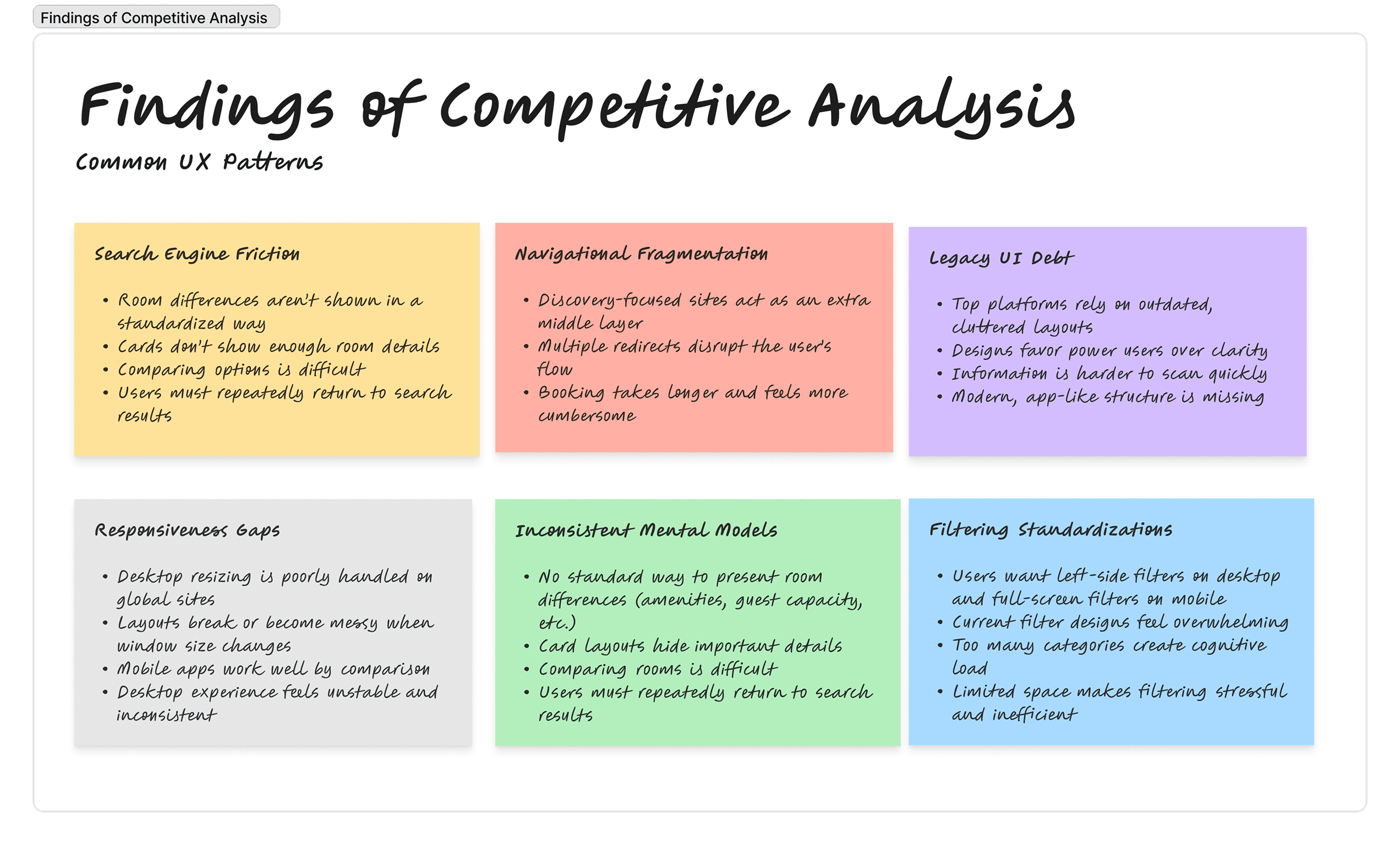
By benchmarking global leaders against the specific needs of the Sri Lankan domestic market, I identified critical friction points in the search-to-booking journey. The table below outlines the competitive landscape and the specific UX Enhancements I integrated to leapfrog these legacy challenges.
Platform | Primary Strength | UX Friction Point | UX Enhancement (The Solution) |
|---|---|---|---|
Hotels.com | High filter depth & Expedia backing | Rigid guest-to-room input logic; poor pricing flexibility. | Intent-Based Guest Logic: Developed a dynamic selection modal that allows users to adjust guest counts without being locked into "room-first" constraints, enabling faster price discovery. |
Tripadvisor | High trust via social proof & modern UI | "Middleman" friction; multi-step redirection breaks the user journey. | End-to-End Task Fulfillment: Synthesized minimalist aesthetics with a native booking engine, eliminating redirections to keep the user in a high-trust, single-platform ecosystem. |
Booking.com | Massive inventory & utility | Cluttered IA; Poor responsiveness on desktop-resized views. | Fluid Responsive Framework: Re-engineered the interface using a mobile-first fluid grid that maintains high-utility search components across all breakpoints, correcting the scaling issues of global giants. |
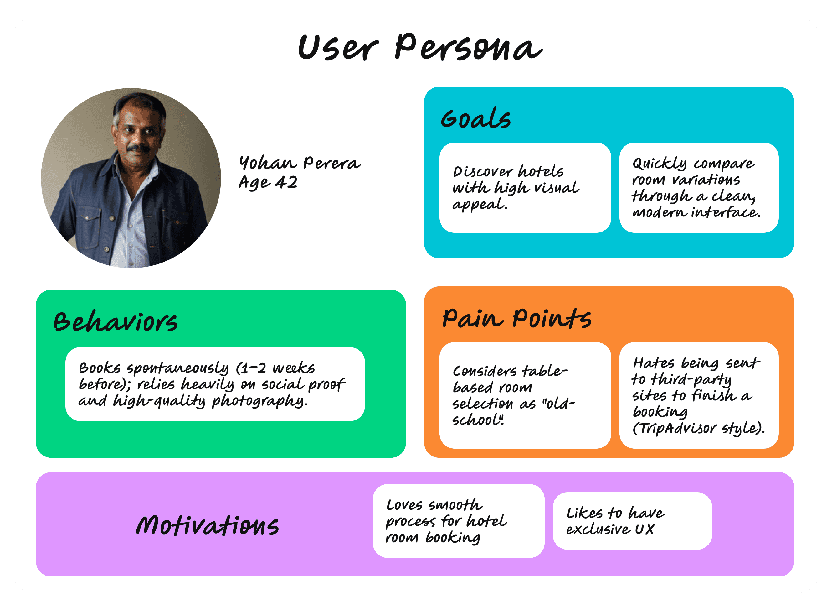
User Personas: Designing for Local Nuance
Rather than generic travelers, I identified archetypes that represent the core of the Sri Lankan domestic market. This personas helped me prioritize features like flexible room logic and localized trust markers.
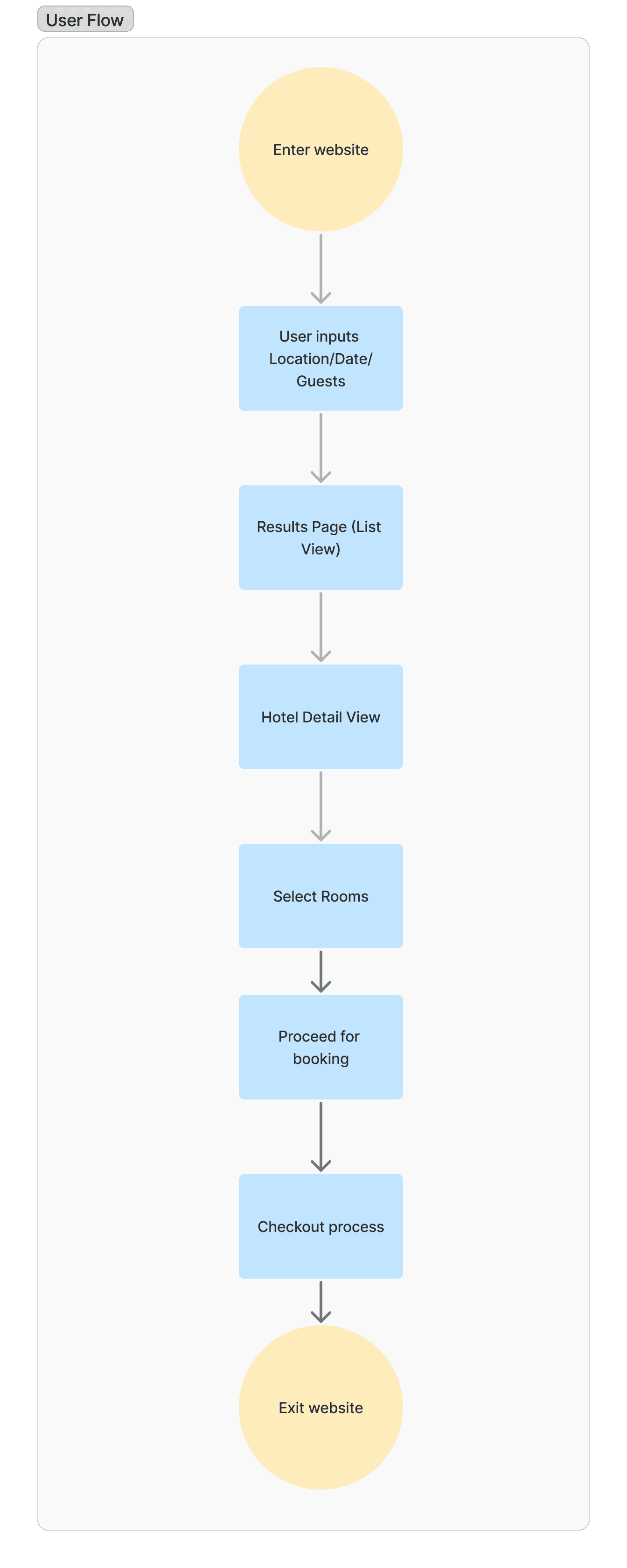
The Core Booking Flow (High-Conversion Path)
This flow prioritizes speed and efficiency, focusing on the "leap-forward" search logic that eliminates legacy friction.
Strategic Impact & Performance Forecast
The following table highlights the anticipated shift in key performance indicators (KPIs) and user sentiment following the implementation of the proposed enhancements.
Proposed Solution | Primary UX Metric | Possible Impact / Strategic Value |
Intent-Based Search Logic | Task Success Rate | Minimum 30% reduction in entry errors: Eliminating the need for manual room-to-guest math (ex: hotels.com) reduces drop-offs during the initial search phase. |
Hybrid Room Selection UI | Accessible Data | Faster evaluation cycles: Replacing dated tables with expandable and scrollable cards allows users to compare room types 2x faster without visual overwhelm. |
Fluid Grid Architecture | Mobile Engagement | Enhanced Accessibility: Optimized touch-targets and fluid scaling ensure high performance on mid-range "Tablet" devices, widening the accessible user base. |
Minimalist Homepage | Bounce Rate | Reduced Decision Fatigue: A cleaner entry point (v.s. Booking.com’s clutter) encourages users to enter the funnel rather than abandoning due to choice paralysis. |
Project Execution & Technical Strategy
To deliver a scalable solution for Techserw Labs, I established a rigorous design framework focused on market alignment and technical precision. My objective was to engineer a web application that maintains parity with global benchmarks like Booking.com, while leveraging a localized UX strategy to gain a competitive edge in the Sri Lankan market.
Technical Framework & Deliverables
Adaptive Design System: Developed comprehensive interfaces within Figma, utilizing a fluid grid system to ensure seamless performance across four critical breakpoints: 1440px (Desktop), 1200px (Laptop), 768px (Tablet), and 480px (Mobile).
High-Fidelity Prototyping: Engineered interactive prototypes to validate user flows, ensuring that complex transitions such as search-to-selection were intuitive and frictionless before moving to development.
Agile Iteration & Collaboration: Integrated a "Continuous Feedback Loop" into the design process. By presenting progress at every sprint milestone, I facilitated cross-functional critiques with team members, allowing for rapid iterations and data-driven refinements.
Market Alignment: Conducted a feature-parity audit against industry leaders to ensure the final product felt familiar to global travelers while leap-frogging competitor weaknesses in UI modernism and localized utility.
Let's start the wireframe designing
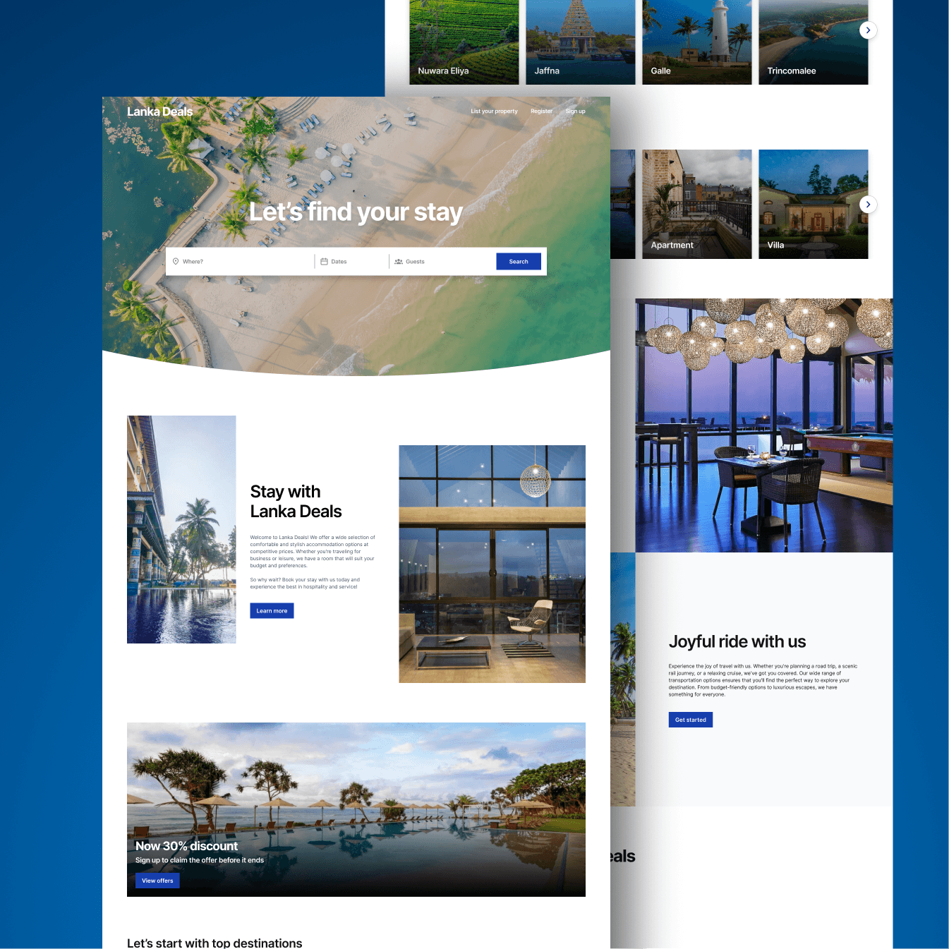
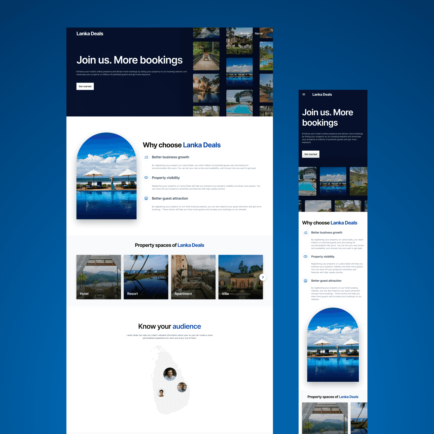
Hotel booking landing page
The home landing page is designed considering that the that the product is new to market. There is complete free are to remove the introduction. As same as other hotel booking web applications, the website that is being designed has the search bar in the hero section as well.

Hotel search result page
Hotel search result page is where the results for the search input are shown. The UI delivers what the user has asked, as well as enables the user to sort them. Here is the desktop version of the wireframe.

Below, you'll find wireframes showing how the UI for the result page is planned to look on tablet and mobile. As previously mentioned in the conclusion, the design incorporates a modal filter form that covers the entire viewport, and the wireframes provide a visual representation of that approach.

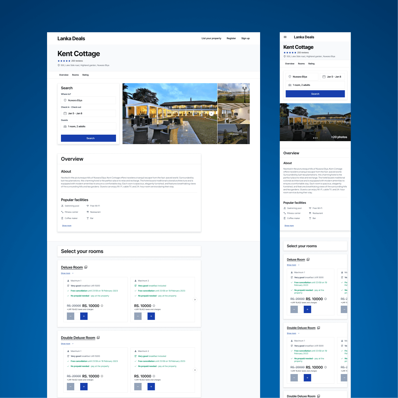
Hotel details page
Hotel details page is where the details of the hotel are shown and here is the wireframe for it. Here is the hotel details page and how rooms are planned to be shown; as card format, which had to be changed later during the design process (will be discussed later).

Hotel review page
The users are allowed to write reviews for the hotels they reserved/visited. Here is how the wireframe for the review page is designed with a form that takes user inputs from the user for the review.

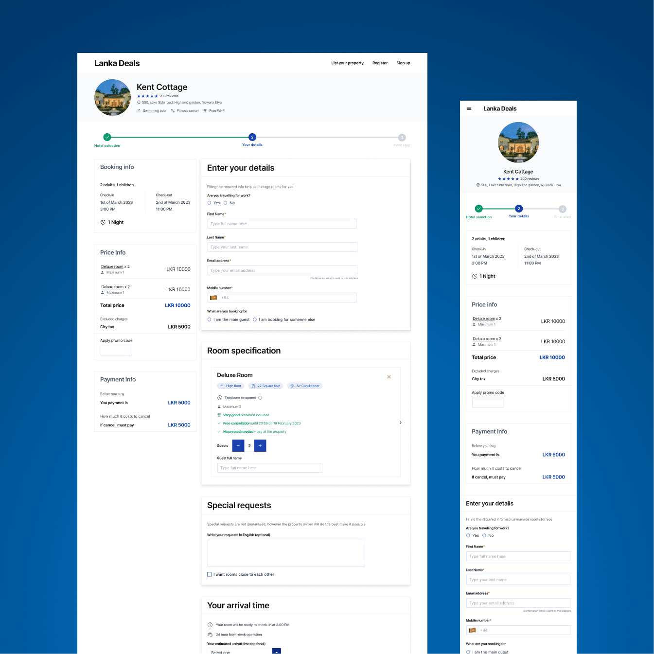
Hotel payment page
The payment page serves as the final UI wireframe in the hotel registration design. On this page, users will find a summary of the hotels they've booked and the total amount they need to pay. Below is the wireframe representing this design.

Login and register page
The login and register interface wireframes are designed. Here are the designed wireframes for them.

Into the designing process
Hotel booking landing page
The hotel booking landing page is the first UI that is designed. The design took a while, as it was the beginning. As the designer, during the design a lot of inspiration is explored. Mainly, focused on consistency and providing solid User Experience. As the modern and minimalistic look was to go, that type of a landing page was designed.

The landing page featured top destinations and hotel categories for the user to select from.

As said previously, consistency was a main factor designing this, hence the features; search bar, navigation features, categories on the home page are provided for the user for a solid User Experience. The UX/UI components in the landing page are down below. Make sure that the components look as well as quality rich.

Hotel search result page
Hotel search result page is where the results for the hotel search query are shown. Down below is the hotel result search page that is designed.

As per the requirement, the result sorting options are designed as well, for both desktop, tablet and mobile. All the designs are prototypes and demonstrated to the team. Down below is the sorting options for the responsive design.

Hotel details page
Hotel details page is the UI where hotel details are shown as well the options to book hotels are given. Down below is the UI that is designed for the hotel details page.

In the given UI, users are enabled to see the images of the hotel with a gallery, read hotel reviews and see available hotel rooms.
Problems that had to face & how they are solved
The problem is this UI was the hotel booking options. Down below is the process that is designed in the first iteration for booking hotels.

However, it was understood that the given process does not allow to display all the hotel room options that come under a single hotel room. For example; a hotel room can have multiple options like with kings bed or without, with food or without, with internet or without. These options were unable to be displayed in the card format.
Let’s take a look at booking.com hotel display. Here, booking.com hotel room display is taken because, that is product criteria that should be met.

Aim is for a fresh design look, and Booking.com's current method of using an HTML-like table for hotel displays seems a bit outdated. In our team meetings, it was decided to find a more modern way to show hotel information.
Presented below is the refined design for our product, offering users an intuitive interface to seamlessly choose rooms within hotels. This comprehensive solution showcases all available room types, providing users with a visually appealing carousel for effortless room exploration. The revamped format ensures enhanced visibility of room options and their associated features, surpassing the effectiveness of the previous card-based presentation.

Hotel review page
Hotel review page is where the reviews for the hotels are submitted. A form is given for the users to submit the reviews about the hotel. Down below is the designed UI for that.

Hotel payment page
The payment page displays the hotel rooms the user has booked. As well as, shows amount the user has to pay. Down below is the designed UI for that.

Login and register page
Login & register UIs are designed for the users with options; email, Google and Facebook. Down below is the designed pages.

Project summary
The Challenge Techserw Labs required a high-performance hotel booking web application to compete in the domestic Sri Lankan market. While global giants like Booking.com offer massive inventory, their old UX and rigid global patterns often create friction for local users. My task was to design an end-to-end booking experience that maintains industry-standard feature parity while leap-frogging competitors through minimalist aesthetics, localized logic, and superior responsive performance.