

Overview
HerWEALTH is a free, self-paced financial education course built by JB Vantage for women in Sri Lanka who are starting from zero. Not investors looking to optimise a portfolio, but women who have never budgeted, never held an investment account, and have been told for most of their lives that money is somebody else's department.
The product is a four-module course wrapped around interactive tools: calculators, worksheets, quizzes, and a diagnostic questionnaire that points each person to the right starting place.
The problem
A free course only works if people can find it, and there is very little financial content written for Sri Lanka. Most of what exists is written for India or the US. The pages had to rank in search and be easy for AI answer engines to pull from, without reading like keyword filler.
Financial education sits very close to financial advice, which is regulated. Every screen had to teach without ever telling anyone what to do with their money.
What I did
My job was to design a product that two different people could get something out of. For the women using it, every screen had to make learning about money feel easy and unintimidating, from someone who has never opened a bank statement to someone ready to plan a retirement. For JB Vantage, the same screens had to convert: get people to sign up, get them into a module, and get them to finish it.
Most of the design decisions below come from holding those two things together instead of trading one off against the other.
1. Designed and built the landing page
link
I designed the HerWEALTH landing page end to end: the narrative order, the hero, how the four modules and the free tools are introduced, the trust and compliance framing, and the sign-up path into the course.
Then I built it myself in code using Claude Code, rather than handing a static file to a developer. It let the team see the real thing in a browser, on real devices, at real breakpoints, and it collapsed the loop between changing a design decision and seeing whether it held up live.

2. Built a reusable module page system
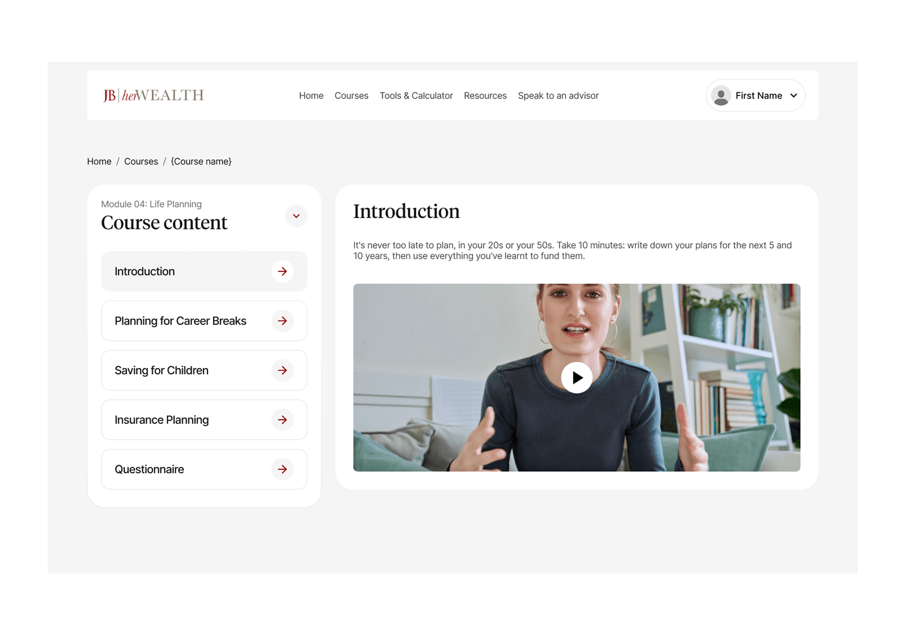
Rather than designing four one-off module pages, I built a master page template that defines every block of a module page, from metadata through to schema, and can be filled for any module in the course.
The template covers page metadata, breadcrumb, hero, about block, course-content accordion, what's inside inventory, how it works, skills gained, outcome sections, why it matters, instructor, reviews, certificate, closing CTA, FAQ, related modules, compliance footer, and the sticky sidebar cards.
I then produced build-ready copy decks for the module pages against that template, working from the actual curriculum in the build rather than a summary of it. On more than one module the brief and the build disagreed on what the module contained. Going to the source and flagging the mismatch before writing saved a rewrite both times.

3. Wrote the SEO and AEO layer
I set the search strategy for the course and the rules that keep it consistent across every page.
Each module page maps to one primary keyword with a plain-language search intent behind it, such as retirement planning in Sri Lanka or planning finances around a career break. Every hero opens with a 40 to 60 word answer that reads correctly on its own, so it can be lifted whole by a search snippet or an AI answer. Outcome headings are phrased as questions people actually type. Three JSON-LD schema blocks (Course, BreadcrumbList, FAQPage) ship with every page.
I also wrote the voice non-negotiables into the guide: sentence case, no exclamation marks, no em dashes, no fabricated reviews or ratings, sourced statistics only, and education framing rather than advice framing on every single line.
4. Redesigned the quiz system
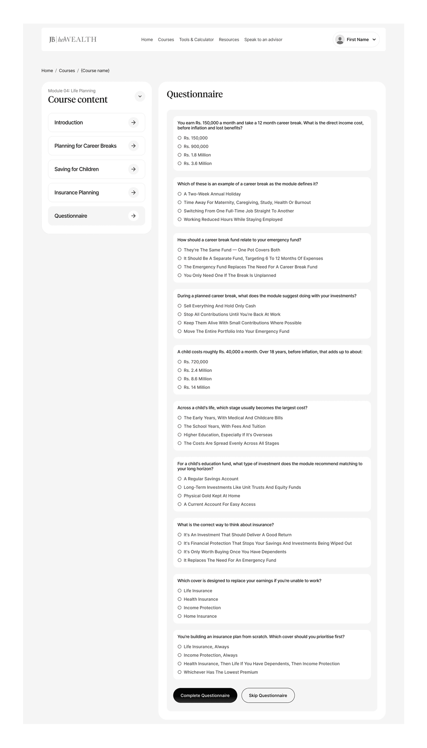
Each module shipped with five placeholder questions. I took them to ten and restructured how they work.
The ten questions map to the module's actual sub-topics, roughly three to four per section, instead of ten variations of the same question. Formats mix between multiple choice, scenario-based, and true or false so the set does not go flat. Wrong answers return a one-line explanation, which turns the quiz into part of the teaching rather than a gate in front of it. Pass threshold, retake behaviour, progress indication, and answer-locking after feedback are all defined as states, not left to the build.
5. Designed the Tools and Calculators section
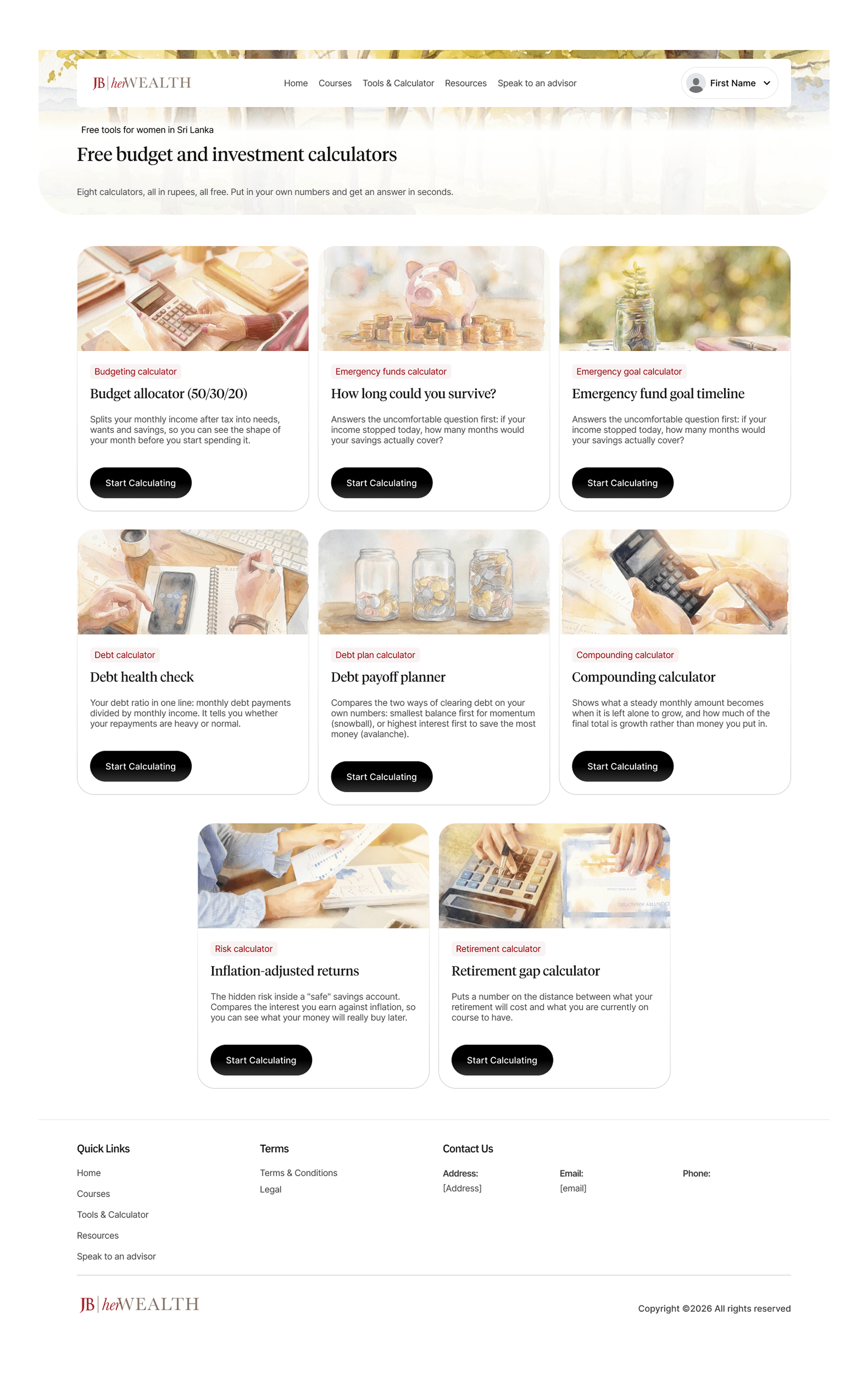
This started as one page in the brief. It needed to be three page types, and keeping them distinct is what makes the section work.
The hub is a filterable grid of every tool in the course, tagged by category and source module, with each card carrying the one-line outcome and an estimated time.
The tool information page explains what the tool does, why it matters, and what it assumes, in plain language. This is the SEO-facing page, and it carries the required "illustrative only, not advice" line.
The tool page itself is the calculator, and it is fully usable logged out. No signup wall. Someone can run the retirement gap calculator, get a number, and leave. Sign-up is only asked for if they want to save or export the result. The soft next step at the results stage points back to the module that explains the number, which is a better conversion path than a paywall and stays honest to a free product.
6. Designed the Resources page and result screens
Resources brought together a plain-English glossary, downloadable worksheets kept separate from the interactive tools, and curated links to the sources already cited across the course, including the Central Bank and the Department of Census and Statistics.
For results, I split what the brief treated as one screen into two. The quiz result shows score, pass state, a correct and incorrect breakdown, certificate unlock or a review-and-retake path, and a route into the next module. The diagnostic result has no pass or fail at all. It returns a personalised starting point: one module and one or two relevant tools.
The failure and beginner states are written to read as encouraging rather than punitive. That is a small thing that matters a lot on a product aimed at people who already suspect this is not for them.
The iteration: from email capture to real accounts
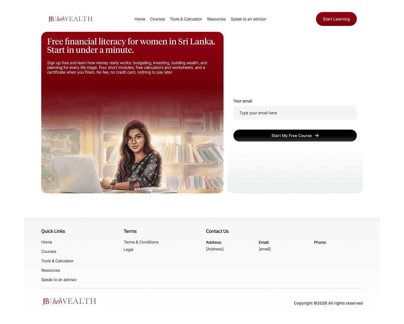
The first sign-up I designed was one field, email only. Lowest possible barrier for a hesitant audience.
It worked for entering the course and failed at finishing it. The course issues a certificate, and nothing tied that email to the person typing it. Anyone could enter someone else's address and generate a certificate in a name that was not theirs.
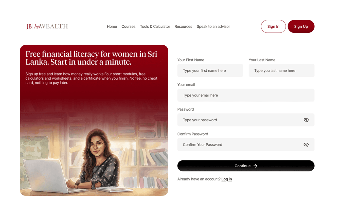
In the second iteration sign-up became real account creation, with a password and a verified email, so the credential has an owner. The tools stayed open logged out. The account is only required where the platform holds something for you: progress, saved results, and the certificate. The copy says exactly that instead of "sign up to continue".
Before:
After:
The lesson: I had optimised for the metric closest to the form. Tracing the flow to what it issues, not to its conversion event, is what surfaced the gap.