For a Figma preview of redesigned Commitbiz landing page Click Here
A little introduction to CommitBiz
Commitbiz Middle East is a consultancy firm that specializes in providing business setup and advisory services in the United Arab Emirates (UAE) and other parts of the Middle East. They assist entrepreneurs and businesses in establishing their presence in the region by offering guidance on company formation, incorporation, licensing, visas, and other legal and administrative requirements.
Commitbiz Middle East aims to simplify the complex process of setting up a business in the UAE, which can involve navigating various regulations, paperwork, and bureaucratic procedures. They typically cater to both local and international clients, helping them understand the local business landscape and facilitating their entry into the market.
Their services may include assistance with choosing the right type of business entity (such as a free zone company, mainland company, or offshore company), drafting legal documents, obtaining necessary permits and approvals, and ensuring compliance with local laws and regulations.
The purpose of redesigning their landing page
The underwhelming effectiveness of the Commitbiz Middle landing page to generate visitor actions is the reason for the makeover. The complicated navigation and antiquated design of the page make it difficult for users to engage with it effectively, which lowers conversion rates. Improving the page's usability and aesthetic appeal is my goal with this revamp. By making the interface more user-friendly and streamlining the navigation, I hope to motivate visitors to do desired activities, including getting in touch with us or looking up additional information. Commitbiz Middle East hopes to leverage this strategic reorganization to position itself for greater digital success by enhancing its web presence and increasing conversions.
Down below is their current design of the landing page.
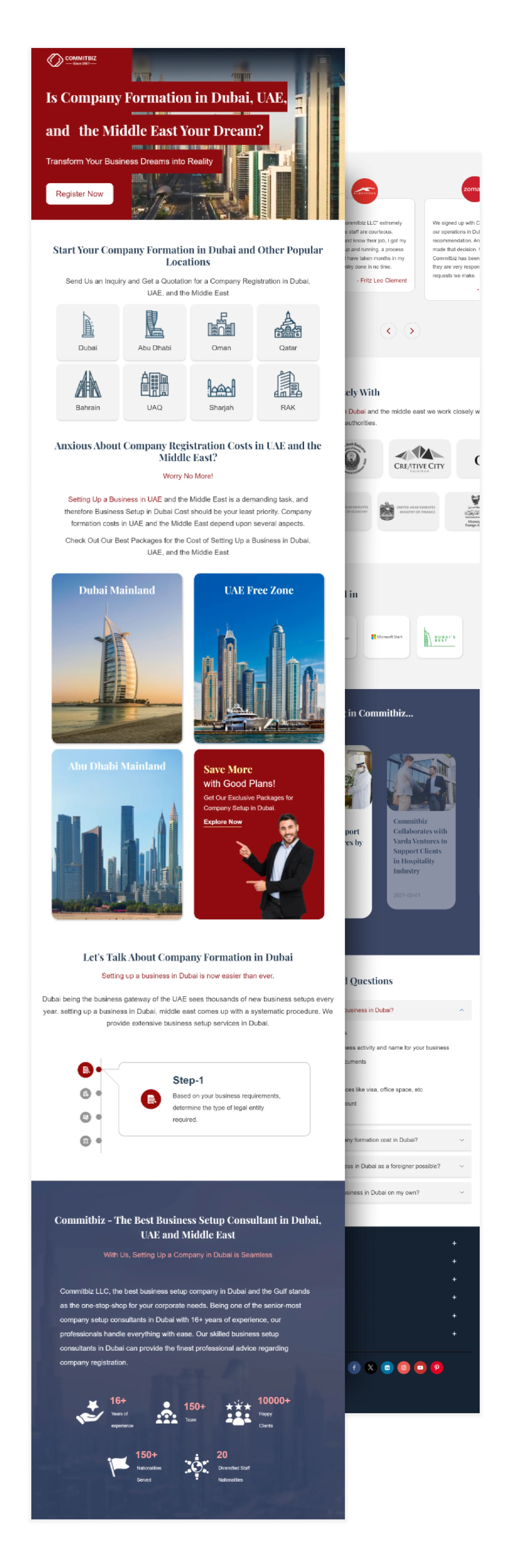
Sneak peak of how the redesign turned out
Is website conversion important for business?
When a website visitor completes a desired activity, such as creating an account or completing a purchase, they become an active participant in digital marketing and cease to be a passive observer. This is known as a conversion. Monitoring conversion rates is essential for expanding a business and increasing profits. By comparing conversion rates across various marketing channels, one can gain insights into the preferences of the target audience, improve marketing tactics, and determine which channels are most useful for achieving objectives
According to MailChimp, conversions, which occur when website visitors complete desired goals like making a purchase, are essential for engaging audiences and driving business growth. Tracking conversion rates across marketing channels provides valuable insights into audience preferences and marketing effectiveness. Additionally, MailChimp highlights the significance of landing pages in boosting conversions, with a notably high conversion rate of 23%.
Breakdown of the current design of Commitbiz
1. Hero section and headline with poor UX and writing
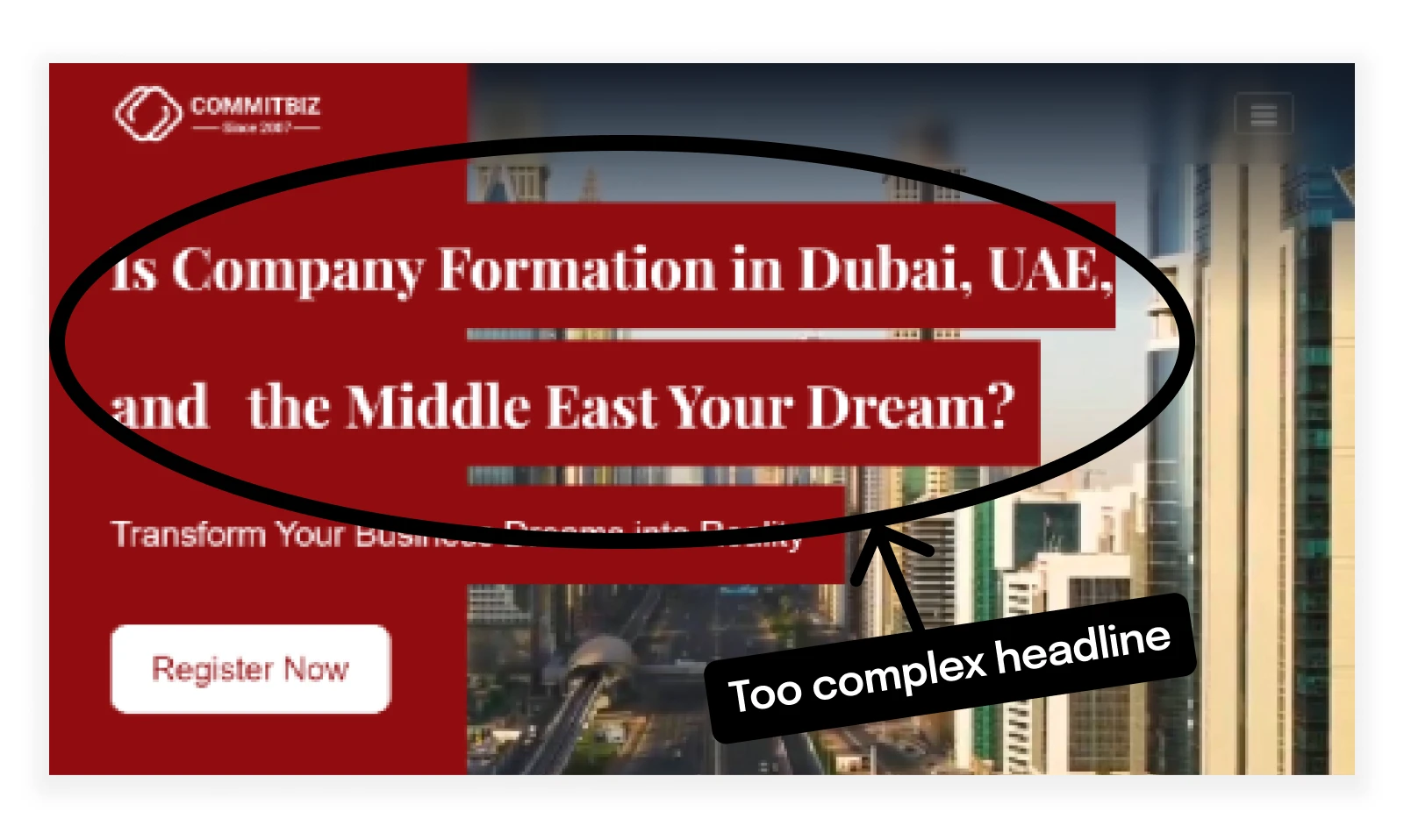
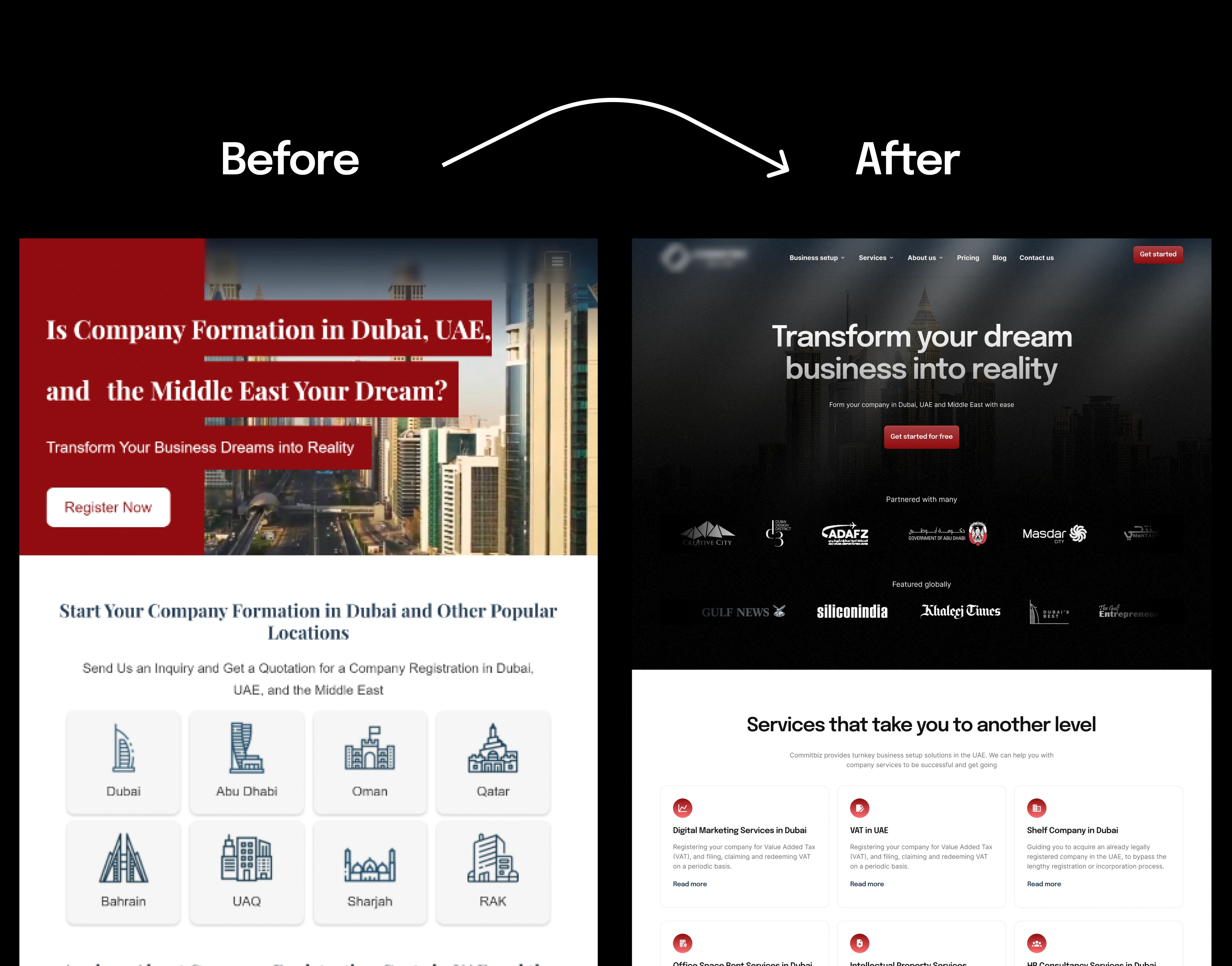
Let's begin analyzing the landing page's available design by focusing on the hero section. The hero section, which presents the company's value proposition to visitors for the first time, is ineffective and unclear. The title, "Is Company Formation in Dubai, UAE, and the Middle East Your Dream?" does a poor job of conveying the main advantages or services that the business provides. Visitors could feel confused and discouraged from studying the page further as a result of this misunderstanding.
As well as, the hero section's call-to-action (CTA) button is marked "Register now." Although this CTA seeks for a reaction from users, it lacks the convincing component that is necessary to successfully promote conversions. Offering an obvious reason to interact with the company's services without making a commitment up front, a more appealing call to action like "Start for free" would likely be more well-received by website visitors.
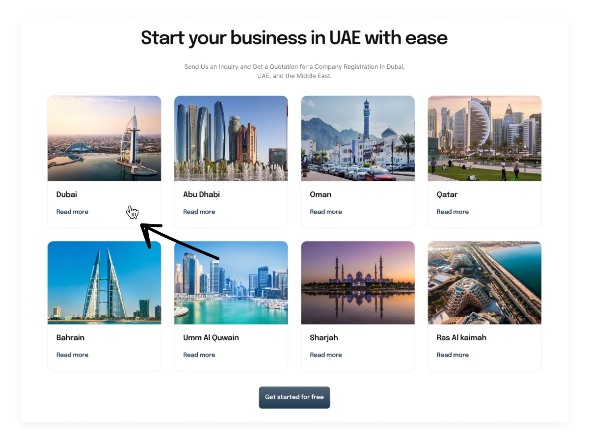
2. Poor User Experience function in location card section
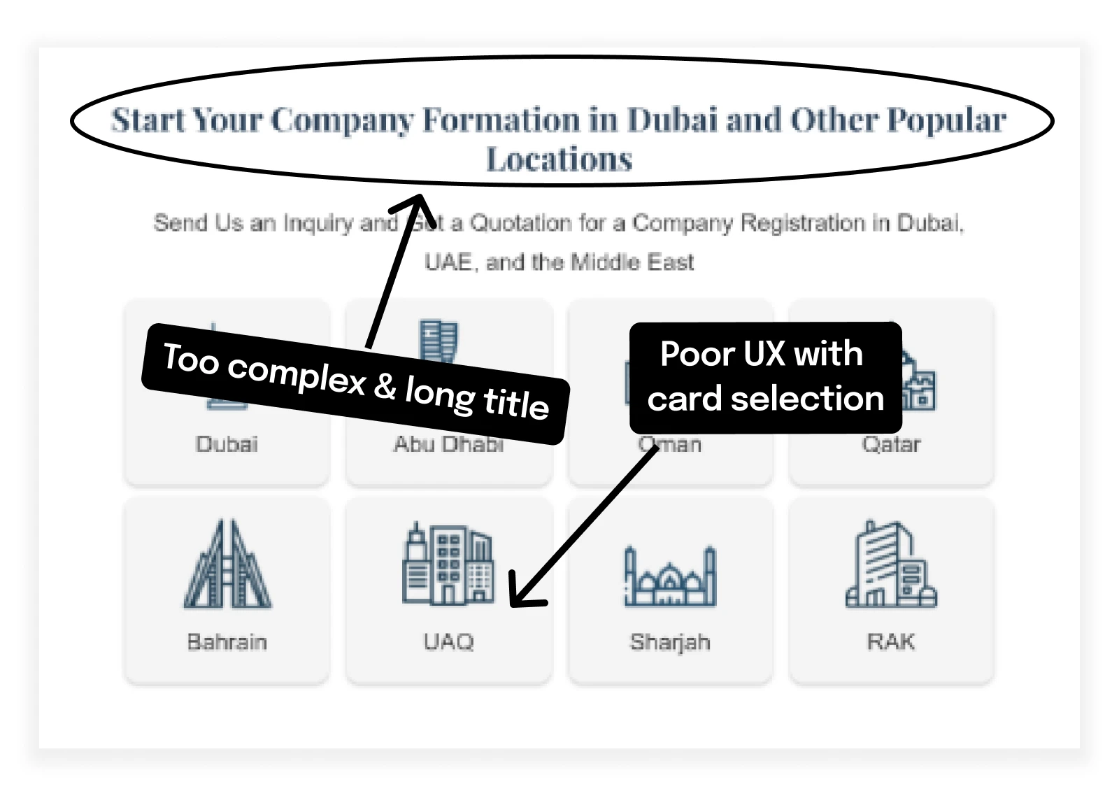
Continuing the breakdown of the landing page, another area of concern is the section allowing users to select different locations in the Middle East. The current user experience (UX) design presents a usability challenge by causing confusion when interacting with the location cards. Upon clicking a card, the remaining cards disappear, and only two more options related to the selected card are displayed. This abrupt change in the layout can be disorienting for users, leading to frustration and decreased engagement.
Additionally, the lack of visual aids, such as images of the location. Utilizing images of the respective locations would not only enhance the visual appeal of the section but also aid users in quickly identifying and recalling their preferred location.
To address these UX issues, a more intuitive solution would be to implement a modal sheet that appears upon clicking a location card. This modal sheet would present the relevant options associated with the selected location while keeping the other location cards visible in the background. This approach maintains consistency in the layout, allowing users to explore different locations seamlessly without disrupting the overall user flow.
By enhancing the visual representation of locations with images and implementing a modal sheet for selecting options, the landing page can significantly improve its UX, reducing confusion and enhancing user engagement with the location selection feature.
3. Offer card selection UX issues
There is a significant UX and conversion problem with the landing page once you look at the offer card section. As of right now, the only way for users to view the content on the cards is by hovering on them to flip them. This may not be an easy process, especially for mobile users, who make up more than 90% of landing page visitors. Users may become frustrated and also leaves them in confusion regarding promotional packages.
To address this issue and improve the user experience, a solution is proposed to display the required information upfront with a clear hierarchy and clickable Call To Action buttons. By presenting the package details directly on the cards, users can easily access the information without the need for additional clicks or interactions. This approach not only streamlines the user experience but also ensures that essential information is readily available, increasing the likelihood of user engagement and conversion.
4. Get started section with UX issues
Considerable UX problems that may affect user engagement and conversion rates can be found by carefully analyzing the section that describes how to get started with Commitbiz. At the moment, users have to manually click on each clickable icon in order to view the appropriate step because the steps are hidden behind them. Because only the first step is presented up front, this design error may cause readers to skip over the area without engaging with the material.
In addition, the steps are shown in a carousel arrangement that automatically plays, with each step changing after a certain amount of time. According to studies, users may find autoplaying carousels annoying since they interfere with their ability to read or interact with the content at their own speed. This method lowers the landing page's user experience and may discourage users from fully understanding the steps necessary to get started with Commitbiz.
One way to solve these UX problems and increase user engagement is to show all the steps up front so users don't have to click on each one. Users don't need to put in any extra work to quickly and easily get the information because the steps are presented in a static way. Additionally, by disabling the carousel's autoplay function, users may read and process the content at their own leisure, which makes for a more comfortable and productive user experience.
5. Achievement section outdated design
A closer look at the landing page's achievement section identifies a number of UX and design flaws that could lower user engagement. A long paragraph outlining Commitbiz's accomplishments is included in the current presentation, which can overwhelm viewers and make them not want to read the rest of the material. According to research, people typically skip reading lengthy texts in favor of information that is clear and visually appealing.
Shortening the paragraph into simpler chunks is suggested as an answer to this problem and to enhance the user experience. By reducing the successes into short sentences or bullet points, visitors can immediately understand Commitbiz's major accomplishments without being overwhelmed by long paragraphs.
6. Overall UI of the design
Examining the Commitbiz landing page's overall visual design highlights a serious problem with outdated looks. The current layout is outdated and ineffective at attracting individuals. Visual appeal is essential in today's online landscape for bringing in and keeping users. Outdated designs can hurt a brand's reputation and discourage potential consumers from interacting with its products.
It is essential that I, the designer, accept responsibility for this problem and redesign the landing page's visual design to give it a far more eye-catching look. In order to produce a visually interesting and engaging user experience, this entails integrating modern design trends, such as clean layouts, brilliant colors, high-quality images, and sleek typography.
I, the designer, should also make sure that all of the landing page's design components are consistent with one another, preserving a unified and consistent look that supports Commitbiz's brand identity. The landing page may efficiently draw in visitors, improve brand perception, and eventually increase engagement and conversion rates by utilizing modern designs and strategies.
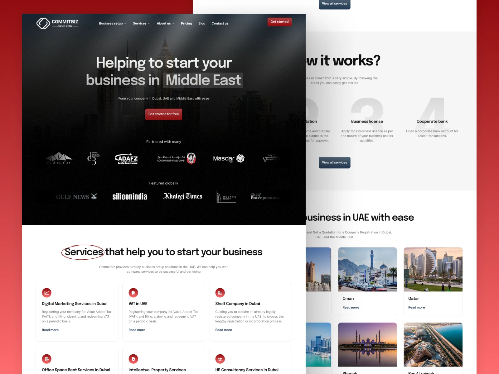
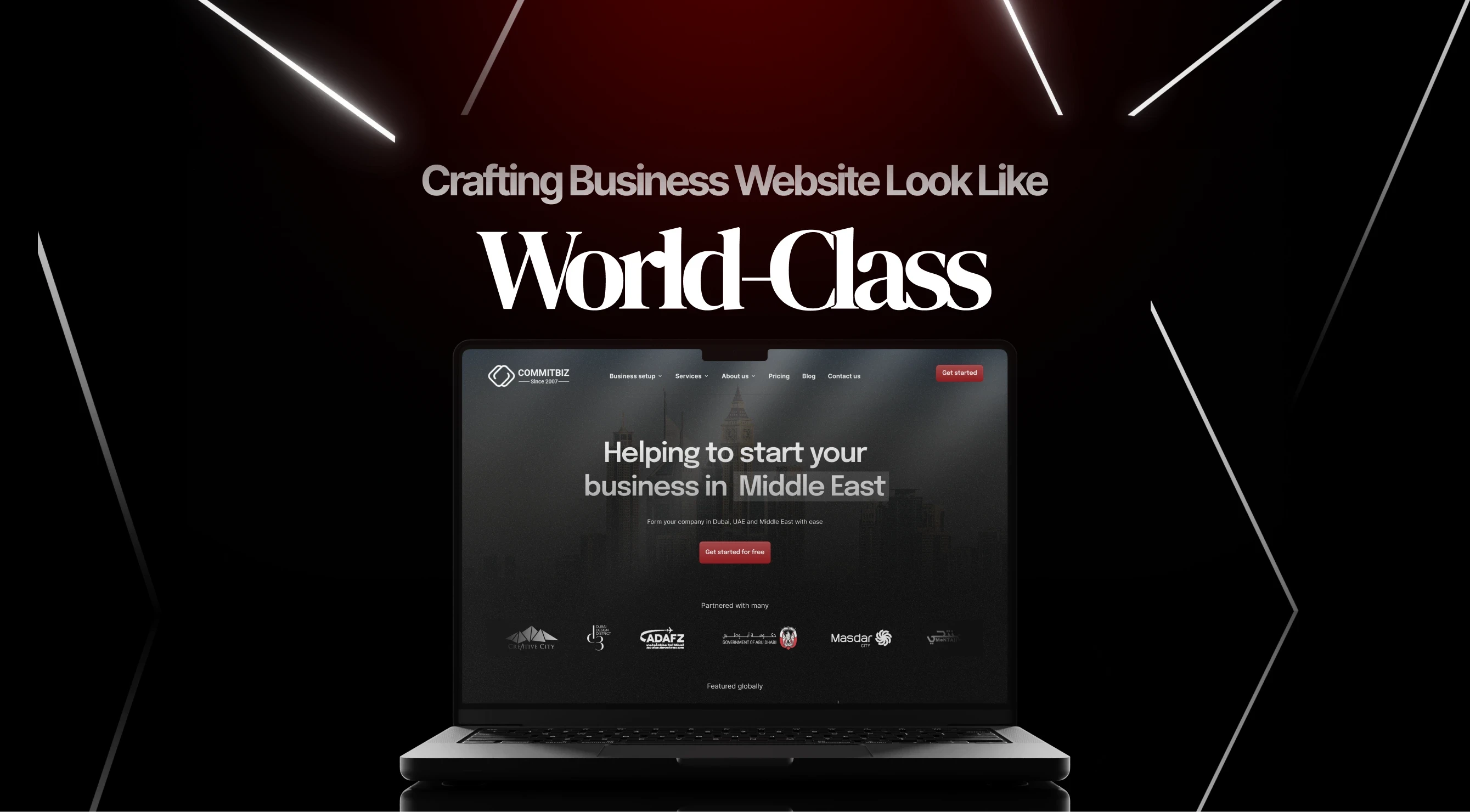
Redesigned Commitbiz landing page
Redesigned landing page breakdown
Hero section breakdown
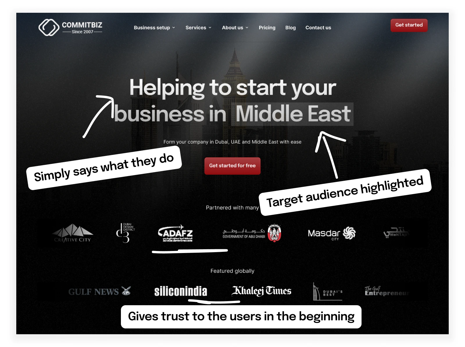
A closer look at the Commitbiz landing page's new hero section identifies a number of enhancements that boost message clarity and conversion rates. With no unnecessary language, the title, "Helping to start your business in the Middle East" clearly and concisely conveys Commitbiz's primary value proposition, making it easier for visitors to access and comprehend. The target audience is readily identifiable by mentioning "Middle East," which increases authenticity and engagement.
Also, Commitbiz's inclusion of organization icons acts as important social proof, giving visitors a sense of legitimacy and confidence. Potential prospects can be reassured of Commitbiz's experience and track record in assisting business setup in the area by displaying recognizable logos of previous clients or partners.
The revamped hero section now features a more attractive call-to-action (CTA) button that reads "Get started for free" rather than "Register now." This phrasing modification is purposefully designed to make visitors want to take action by providing a clear incentive to start using Commitbiz for free. In order to increase conversion rates and engagement, the CTA button emphasizes the advantages of starting for free rather than just registering.
New service section upfront
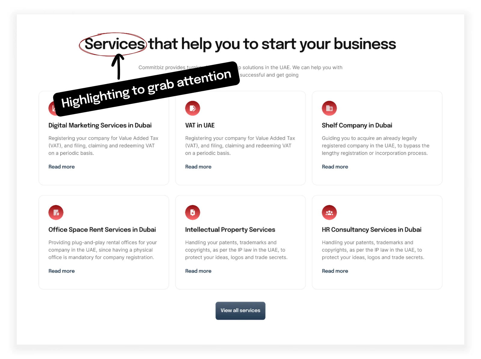
Examining the newly included service section on the revamped Commitbiz landing page reveals an effective improvement that raises the probability of conversion and enhances the user experience overall. In contrast to the previous edition, which did not have a separate service part, the inclusion of this fresh section up front gives users important details about the variety of services Commitbiz offers from the very beginning.
Visitors may immediately decide if Commitbiz offers the specific products or services they are looking for by looking at the services highlighted at the top of the landing page. Users are better able to go to the portions of the website that are most relevant to their needs since they have instant access to the necessary details. Furthermore, by giving visitors access to this upfront data, the landing page becomes informative and gives them the ability to make informed decisions about using Commitbiz's services.
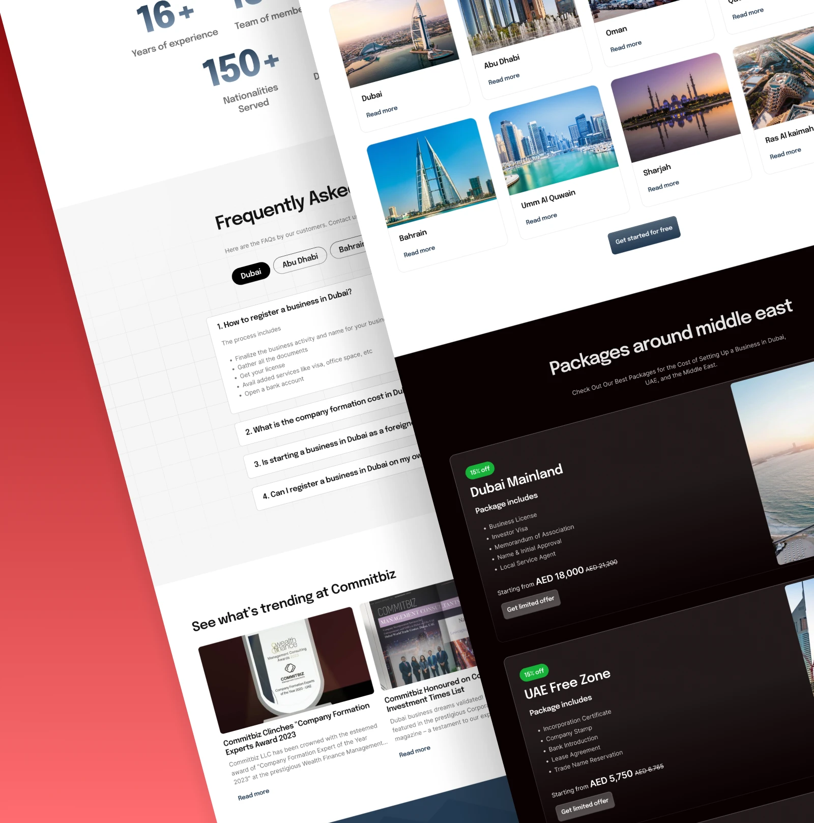
How it works section
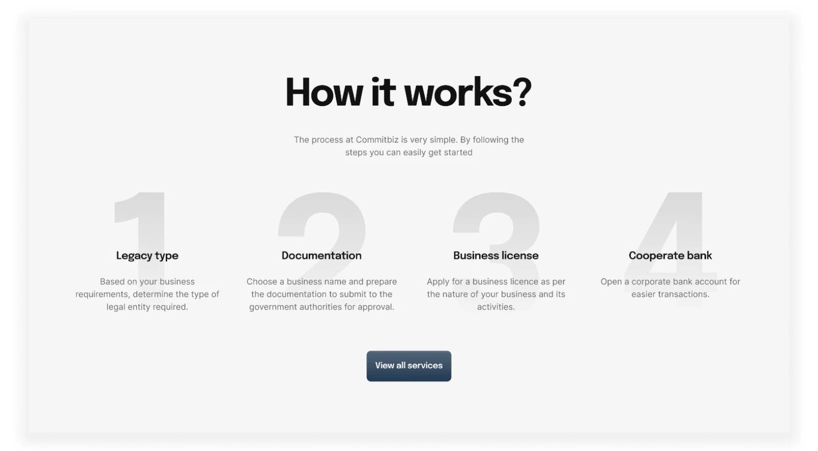
When compared to the previous design, the Commitbiz landing page's "How it works" section has greatly improved in terms of usability and user experience (UX). The section's bad design and unclear content in the previous iteration made it difficult for users to understand and interact with it. The "How it works" part has been redesigned in the new layout, nevertheless, to be far more efficient and user-friendly.
The steps are presented in an easy-to-understand fashion with a summary paragraph for each step, in the redesigned section. This facilitates quick and efficient learning for users. Visitors can more readily understand the steps necessary to interact with Commitbiz's services by utilizing numbers to symbolize every step, which improves clarity and understanding.
Importantly, the new design avoids unnecessary elements such as autoplay, which was a drawback in the original design. By eliminating autoplay, the section allows users to control their interaction with the content, preventing interruptions and frustration commonly associated with autoplaying carousels.
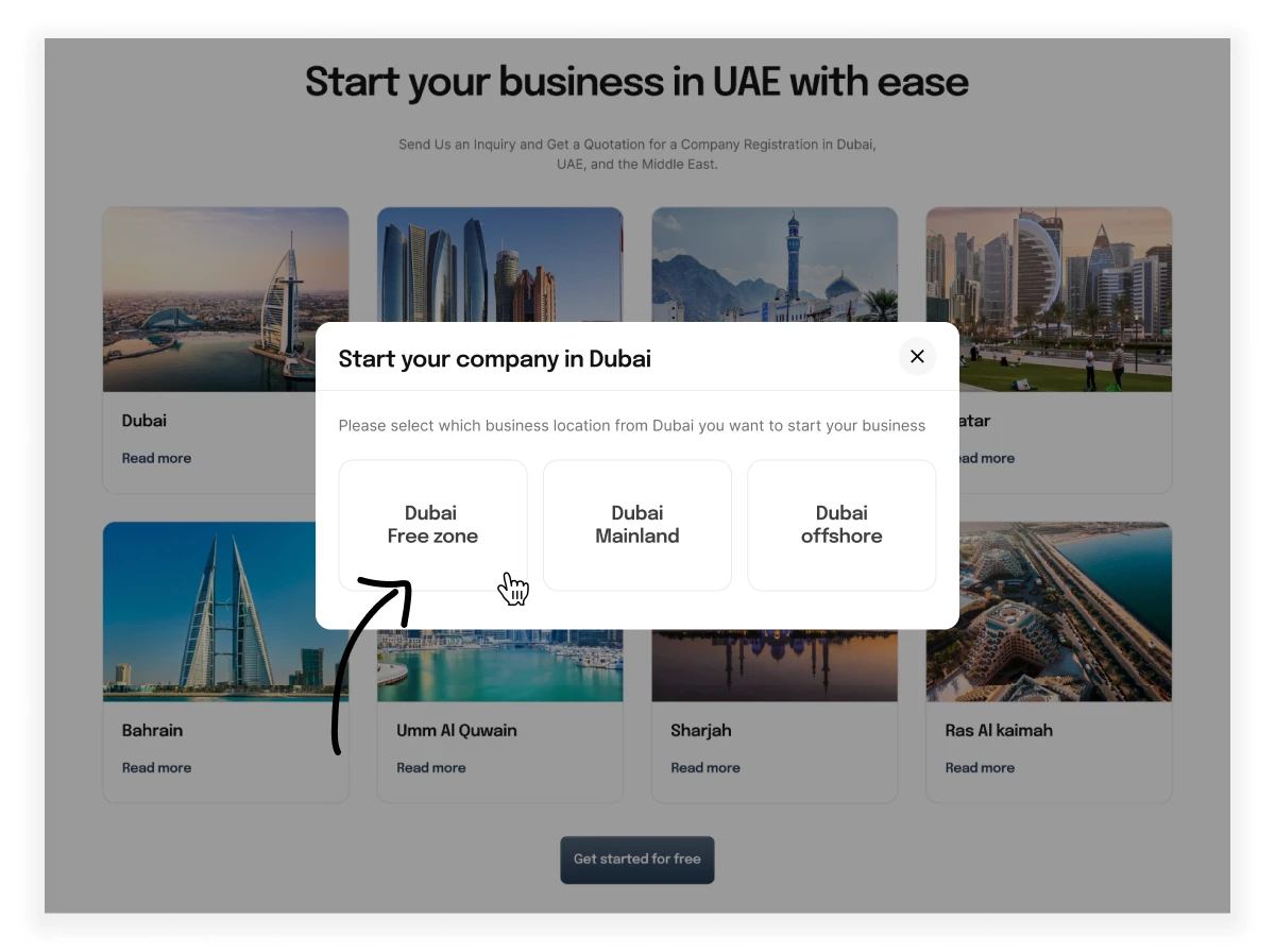
Improved location card section
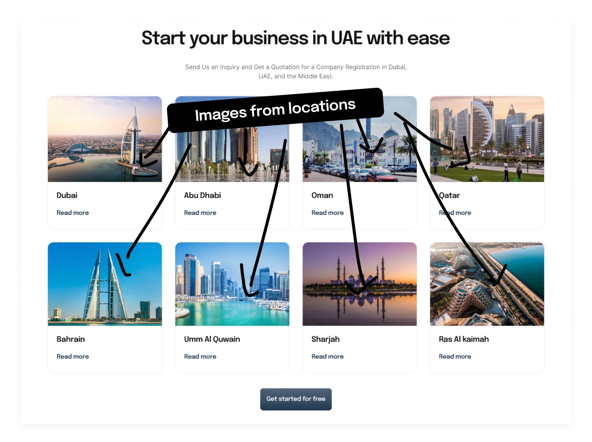
When compared to the previous design, the Commitbiz landing page's new location card section shows a substantial improvement in terms of both visual appeal and user experience. To improve recognition and improve user understanding, images of each place have been included to the corresponding card in the revised design. Since images are easier to remember than words, according to research, this addition is beneficial for conveying details.
More importantly, the UX problem with the previous design, where selecting a card would hide the remaining cards, has been effectively resolved. The updated design allows users to click on a card to bring up a modal sheet with relevant details about the location that was selected, all without hiding the other cards. This method makes things clearer and enhances the user experience by letting users browse various areas without any confusion.
Here is a demonstration of how it is redesigned.
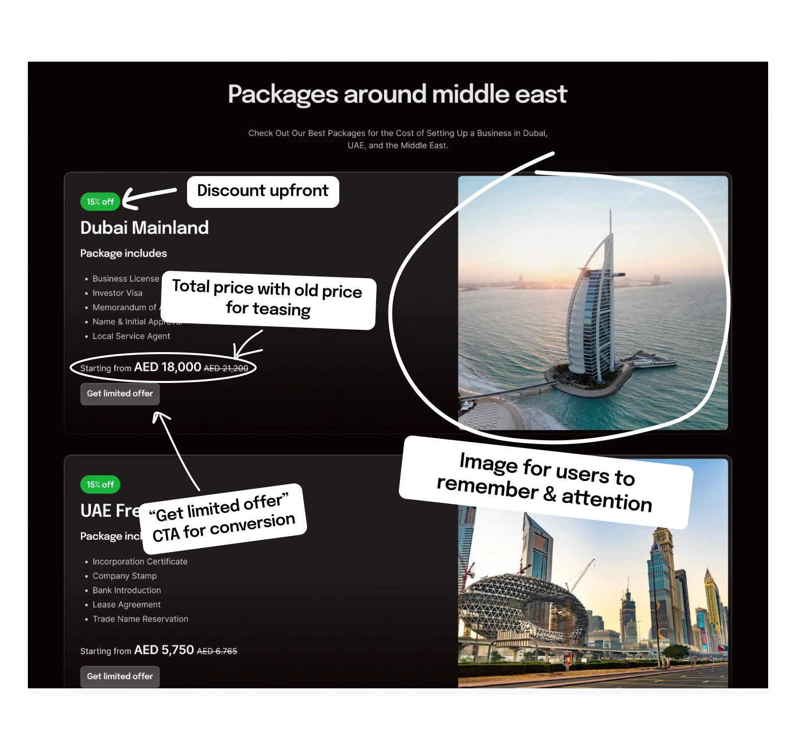
Improved offer card section
Analyzing the redesigned offer card section of the Commitbiz landing page reveals a significant improvement in usability and visual appeal compared to the original design. In the previous version, users could only view the information on the cards by Hovering and flipping them, which posed usability challenges, especially for mobile users. However, in the redesigned version, this issue has been completely addressed.
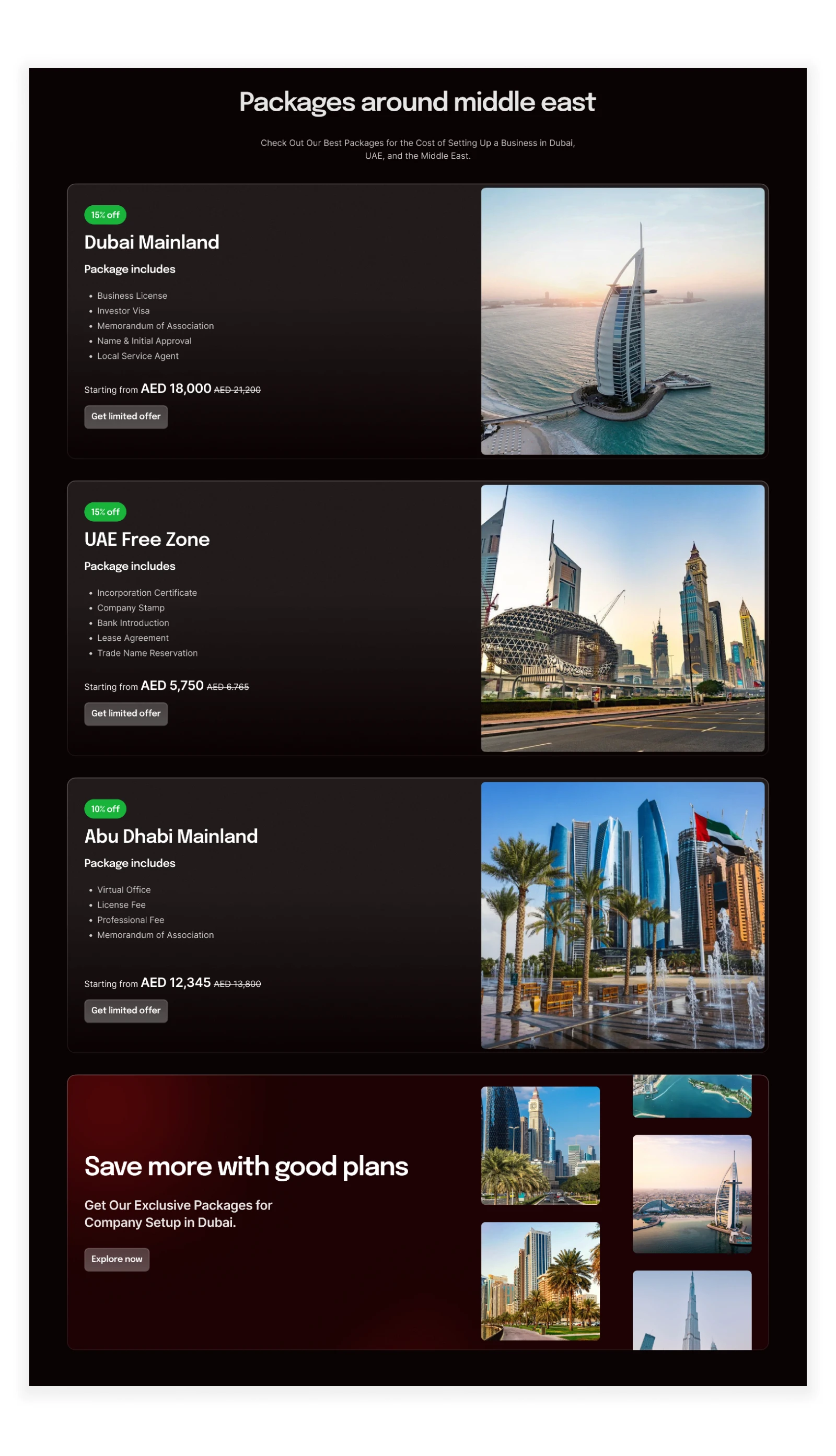
The offer cards are now displayed upfront on the landing page, with each card presented clearly and prominently. This new layout improves usability by allowing users to access the information without the need for additional clicks or interactions. By presenting the cards upfront, visitors can quickly and easily review the available offers, enhancing the overall user experience.
The visual design of the offer cards has been improved as well, with better hierarchy and visual elements to enhance readability and engagement. The redesigned cards are visually appealing, with clear and concise information presented in a structured format. This enhancement not only improves the aesthetics of the section but also makes it easier for users to understand and engage with the content.
Improved achievements & testimonials section
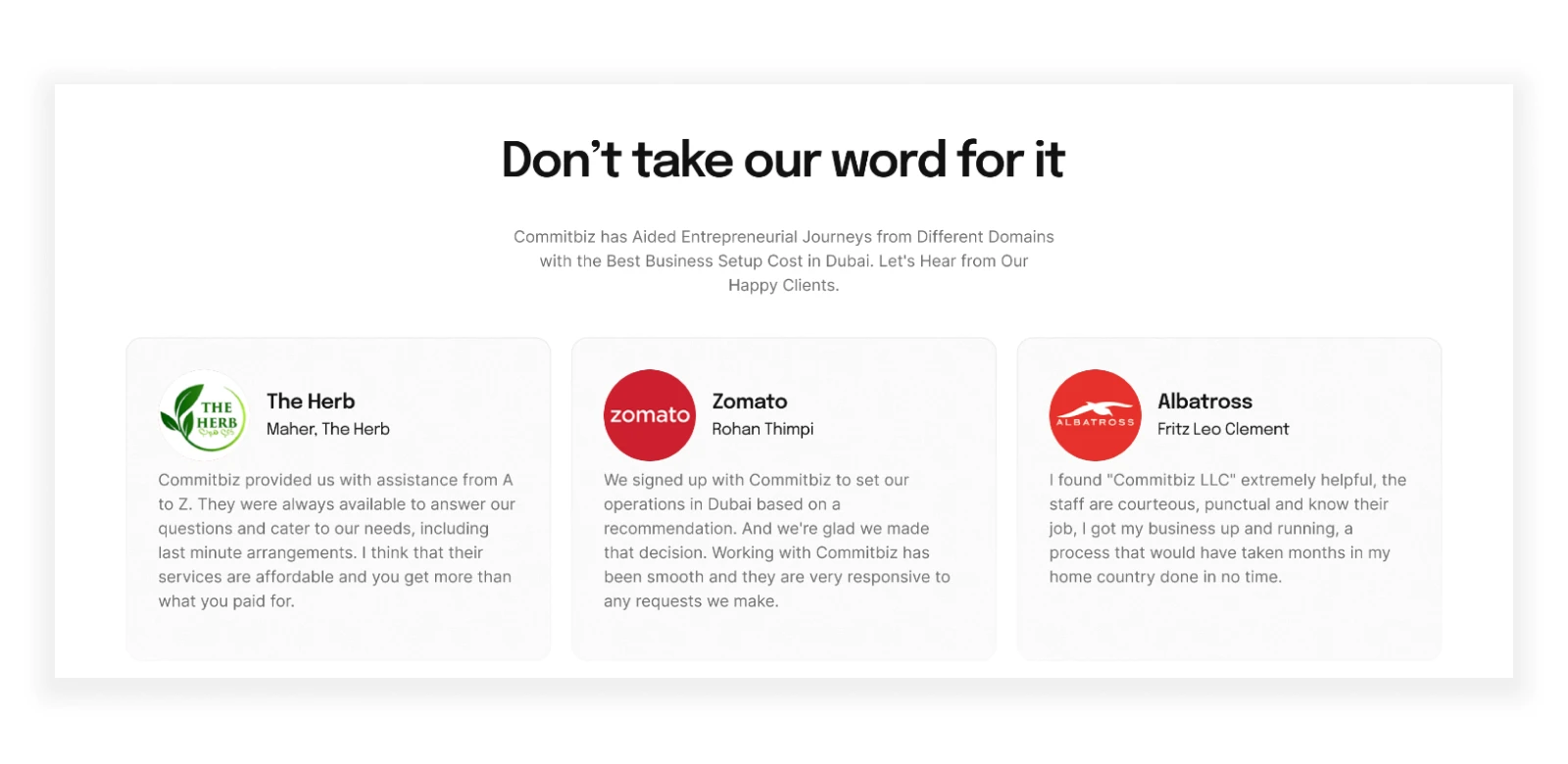
A detailed summary of Commitbiz's accomplishments and customer satisfaction is given to users with the new redesign, which combines testimonials and achievements into a single area. Numbers are used to visually engage and highlight accomplishments, improving readability and impact. Showcasing the company's accomplishments, this well-organized presentation gives guests trust in the organization's legitimacy and knowledge.
Well that's all folks. That's how a landing page is designed that converts better